


While I’m mostly settled on ggplot2 for static plots, I’m always on the lookout for ways to make interactive visualizations. echarts4r is one of my new favorite packages for this. It’s intuitive, powerful, and flexible.
The echarts4r package is an R wrapper for the echarts JavaScript library, an official Apache Software Foundation project (it graduated from incubator status in December). That helps me feel confident I can rely on the JavaScript code underlying the R package.
So let’s take a look at echarts4r.
Package author John Coene explains the basics in a getting started page:
- Every function in the package starts with
e_. - You start coding a visualization by creating an echarts object with the
e_charts()function. That takes your data frame and x-axis column as arguments. - Next, you add a function for the type of chart (
e_line(),e_bar(), etc.) with the y-axis series column name as an argument. - The rest is mostly customization!
Let’s take a look.
Line charts with echarts4r
For example data, I downloaded and wrangled some housing price info by US city from Zillow. If you want to follow along, data instructions are at the end of this article.
My houses_wide data frame has one column for Month (I’m just looking at December for each year starting in 2007) and columns for each city.
Classes ‘data.table’ and 'data.frame':	14 obs. of  10 variables:
 $ Month        : Factor w/ 14 levels "2007-12-31","2008-12-31",..: 1 2 3 4 5 6 7 8 9 10 ...
 $ Austin       : num  247428 240695 237653 232146 230383 ...
 $ Boston       : num  400515 366284 352017 363261 353877 ...
 $ Charlotte    : num  193581 185012 174552 162368 150636 ...
 $ Chicago      : num  294717 254638 215646 193368 171936 ...
 $ Dallas       : num  142281 129887 130739 122384 115999 ...
 $ New York     : num  534711 494393 459175 461231 450736 ...
 $ Phoenix      : num  239798 177223 141344 123984 114166 ...
 $ San Francisco: num  920275 827897 763659 755145 709967 ...
 $ Tampa        : num  248325 191450 153456 136778 120058 ...
I’ll start by loading the echarts4r and dplyr packages. Note I’m using the development version of echarts4r to access the latest version of the echarts JavaScript library. You can install the dev version with these lines:
remotes::install_github"JohnCoene/echarts4r")
library(echarts4r)
library(dplyr)
In the code below, I create a basic echarts4r object with Month as the x-axis column.
houses_wide %>%
  e_charts(x = Month)
If you’re familiar with ggplot, this first step is similar: It creates an object, but there’s no data in the visualization yet. You’ll see the x axis but no y axis or data.

Depending on your browser width, all the axis labels may not display because echarts4r is responsive by default — you don’t have to worry about the axis text labels overwriting each other if there's not enough room for them all.
Next, I’ll add the type of chart I want and the y-axis column. For a line chart, that’s the e_line() function. It needs at least one argument, the column with the values. The argument is called serie, as in singular of series.
houses_wide %>%
  e_charts(x = Month) %>%
  e_line(serie = `San Francisco`)
 Screen shot by Sharon Machlis, IDG
Line chart of Zillow data created with echarts4r.
There are many other chart types available, including bar charts with e_bar(), area charts e_area(), scatter plots e_scatter(), box plots e_boxplot(), histograms e_histogram(), heat maps e_heatmap(), tree maps e_tree(), word clouds e_cloud(), and pie charts e_pie(). You can see the full list on the echarts4r package website or in the help files.
Each of the chart-type functions take column names without quotation marks as arguments. That’s similar to how ggplot works.
But most functions listed here have versions that take quoted column names. That lets you use variable names as arguments. John Coene calls those “escape-hatch” functions, and they have an underscore at the end of the function name, such as:
e_line(Boston)
my_city <- "Boston"
e_line_(my_city)
This makes it simple to create functions out of your chart code.
Next, I’ll add a second city with another e_line() function.
houses_wide %>%
  e_charts(x = Month) %>%
  e_line(serie = `San Francisco`) %>%
  e_line(serie = Boston)
There are no tooltips displayed by default, but I can add those with the e_tooltips() function. Notice that commas are added to the tooltip values by default, which is nice.
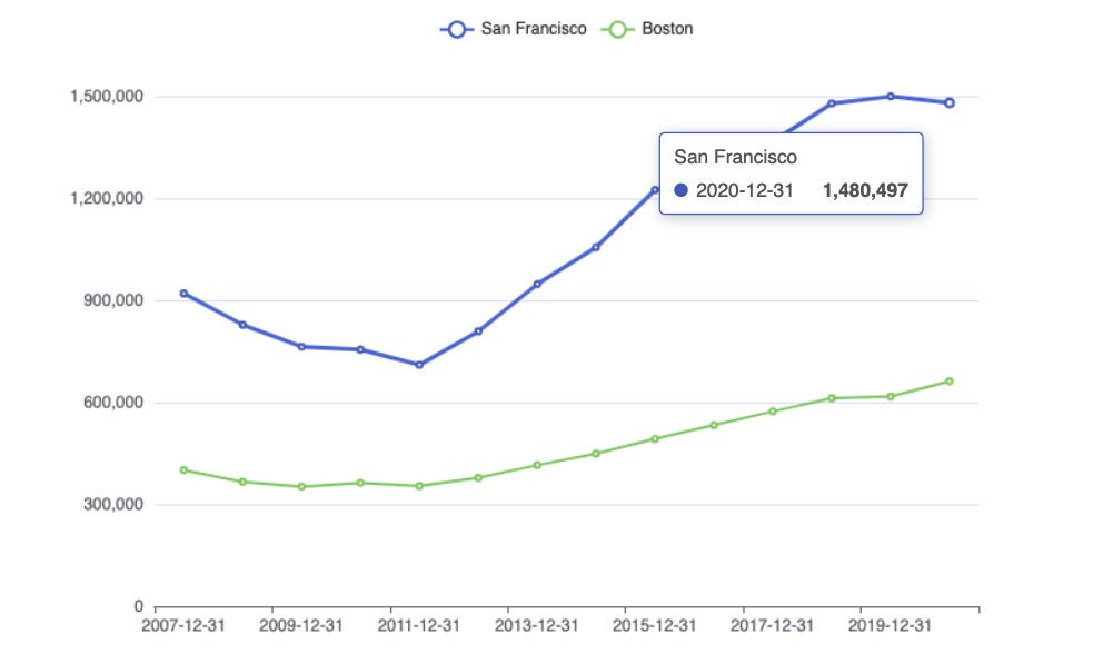 Screen shot by Sharon Machlis, IDG
echarts4r line chart with two series and tooltips.
But the tooltip here could be even more useful if I could see both values at the same time. I can do that with this function:
e_tooltip(trigger = "axis")
I can turn this line chart into a grouped bar chart just by swapping in e_bar() for e_line().
Customize chart colors with echarts4r
You’ll probably want to customize the colors for your charts at some point. There are 13 built-in themes, which you can see on the echarts4r website. In the code below, I first save my chart in a variable called p so I don’t have to keep repeating that code. Then I add a theme, in this case bee-inspired, with e_theme("bee-inspired")
p <- houses_wide %>%
  e_charts(x = Month) %>%
  e_line(serie = `San Francisco`) %>%
  e_line(serie = Boston) %>%
  e_tooltip(trigger = "axis")
p %>%
  e_theme("bee-inspired")
You can create your own theme from scratch or modify an existing one. There’s an online theme builder tool to help. To use that tool, create your customizations, download the JSON file for your theme, and use e_theme_custom("name_of_my_theme") to add it to a plot.
You can also tweak a theme right in your graph code — for example, changing a theme’s background color with code such as:
p %>%
  e_theme_custom("mytheme.json") %>%
  e_color(background = "ivory")
You don’t need to use a theme to customize your graph, however; the e_color() function works on graph defaults as well. The first argument for e_color() is a vector of colors for your lines, bars, points, whatever. Below I first create a vector of three colors (using color names or hex values). Then I add that vector as the first argument to e_color():
my_colors <- c("darkblue", "#03925e", "purple")
p <- houses_wide %>%
  e_charts(x = Month) %>%
  e_line(serie = `San Francisco`) %>%
  e_line(serie = Boston) %>%
  e_line(serie = Austin) %>%
  e_tooltip(trigger = "axis") %>%
  e_color(my_colors)
RColorBrewer palettes
I don’t see RColorBrewer palettes built into echarts4r the way they are in ggplot, but it’s easy to add them yourself. In the following code group, I load the RColorBrewer library and create a vector of colors with the brewer.pal() function. I want three colors using the Dark2 palette (one of my favorites):
library(RColorBrewer)
my_colors <- brewer.pal(3, "Dark2")
my_colors
## [1] "#1B9E77" "#D95F02" "#7570B3"
p %>%
  e_color(my_colors)
 Screen shot by Sharon Machlis, IDG
echarts4r line chart with an RColorBrewer palette.
Paletteer palettes
By the way, a similar format lets you use the R paletteer package to access a load of R palettes from many different R palette packages. The code below looks at the Color_Blind palette from the ggthemes collection and selects the first, second, and fifth of those colors.
library(paletteer)
paletteer_d("ggthemes::Color_Blind")
my_colors <- paletteer_d("ggthemes::Color_Blind")[c(1,2,5)]
p %>%
  e_color(my_colors)
 Screen shot by Sharon Machlis, IDG
Color-blind palette from ggthemes
If you’re not familiar with the paletteer package, the function paletteer_d() accesses any of the available discreet color palettes. Here I wanted Color_Blind from ggthemes, and I chose colors 1, 2, and 5 for the my_colors vector.
Long-format “tidy” data
If there are a lot of series in your data, you probably don’t want to type out each one by name in a separate function call. And you don’t have to. echarts4r handles long-format “tidy” data elegantly.
For this group of examples, I’ll use a data frame in long format with condo price info. Information on how to create your own copy of the data is at the end of this article.
Don’t miss the next code group: I use dplyr’s group_by() function on the data frame before running e_charts() on it, and echarts4r understands that. Now if I tell echarts4r to use Month for the x axis and Value for the y axis, it knows to plot each group as a separate series. (I’m also saving this graph to a variable called myplot.)
myplot <- condos %>%
  group_by(City) %>% #<<
  e_charts(x = Month) %>%
  e_line(serie = Value) %>%
  e_tooltip(trigger = "axis")
myplot
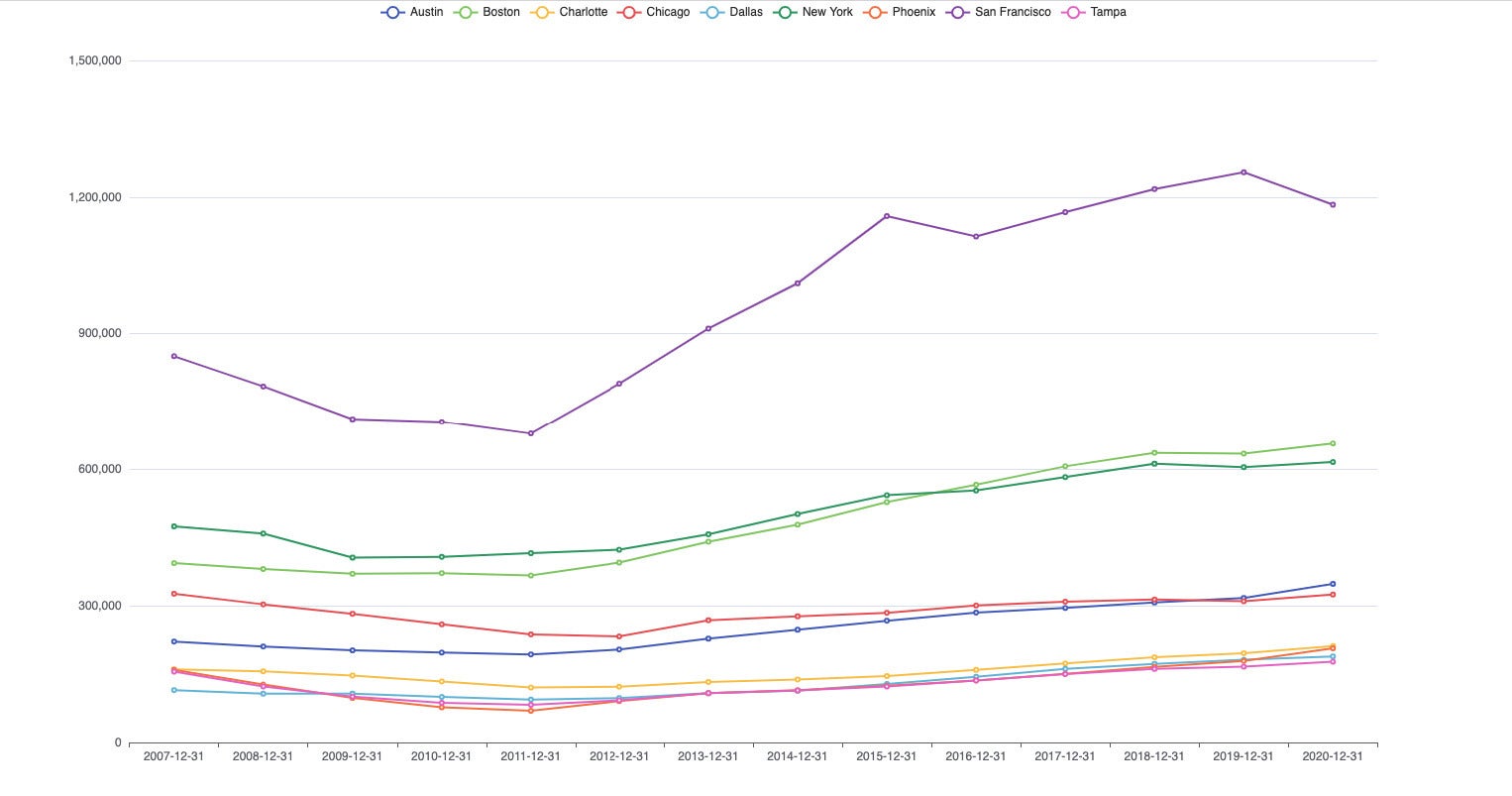 Screen shot by Sharon Machlis, IDG
echarts4r line chart with legend at the top.
The legend at the top of the graph isn’t very helpful, though. If I want to find Tampa (the pink line), I can mouse over the legend, but it will still be hard to see the highlighted pink line with so many other lines right near it. Fortunately, there's a solution.
Custom legend
In the next code group, I add functions e_grid() and e_legend() to the graph.
myplot %>%
  e_grid(right = '15%') %>%
  e_legend(orient = 'vertical',
           right = '5', top = '15%')
The e_grid(right = '15%') says I want my main graph visualization to have 15% padding on the right side. The e_legend() function says to make the legend vertical instead of horizontal, add a five-pixel padding on the right, and add a 15% padding on the top.
 Screen shot by Sharon Machlis, IDG
Line chart with legend on the side.
That helps, but if I want to only see Tampa, I need to click on every other legend item to turn it off. Some interactive data visualization tools let you double-click an item to just show that one. echarts handles this a little differently: You can add buttons to “invert” the selection process, so you only see the items you click.
To do this, I added a selector argument to the e_legend() function. I saw those buttons in a sample echart JavaScript chart that used selector, but (as far as I know) it’s not built-in functionality in echarts4r. John only hard-coded some of the functionality in the wrapper; but we can use all of it -- with the right syntax.
Translate JavaScript into echarts4r R code
A quick detour for a little “how this works under the hood” explanation. Below is an example John Coene has on the echarts4r site. You can see the original echarts JavaScript documentation in the image (you’ll probably need to click to expand it): tooltip.axisPointer.type. tooltip is an available echarts4r function, e_tooltip(), so we can use that in R. axisPointer is a tooltip option, but it’s not part of the R package. One of axisPointer’s options is type, which can have a value of line, shadow, none, or cross.
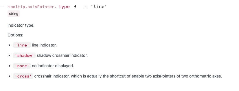 Apache Software Foundation
So, we need to translate that JavaScript into R. We can do that by using axisPointer as an argument of e_tooltip(). Here’s the important part: For the value of axisPointer, we create a list, with the list containing type = "cross".
e_tooltip(axisPointer = list(type = "cross"))
If you know how this works, you have all the power and flexibility of the entire echarts JavaScript library, not only the functions and arguments John Coene coded into the package.
To create two selector buttons, this is the JavaScript syntax from the echarts site:
selector: [
  {
    type: 'inverse',
    title: 'Invert'
  },
  {
    type: 'all or inverse',
    title: 'Inverse'
  }
]
And this is the R syntax:
e_legend(
  selector = list(
    list(type = 'inverse', title = 'Invert'),
    list(type = 'all', title = 'Reset')
  )
)
Each key-value pair gets its own list within the selector list. Everything’s a list, sometimes nested. That’s it!
Plot titles in echarts4r
OK let’s turn to something easier: a title for our graph. echarts4r has an e_title() function that can take arguments text for the title text, subtext for the subtitle text, and also link and sublink if you want to add a clickable URL to either the title or subtitle.
If I want to change the alignment of the headline and subheadline, the argument is left. left can take a number for how much padding you want between the left edge and the start of text, or it can take center or right for alignment as you see here:
myplot %>%
  e_title(text = "Monthly Median Single-Family Home Prices",
          subtext = "Source: Zillow.com",
          sublink = "https://www.zillow.com/research/data/",
          left = "center"
  )
left = "center" isn’t very intuitive for new users, but it does make some sense if you know the background.
Color charts by category with echarts4r
For these color-by-group demos, I’ll use a data set with columns for the city, month, condo value, single-family home value, and “region” (which I just made up for purposes of coloring by group; it’s not a Zillow region).
head(all_data_w_type_columns, 2)
    City      Month  Condo SingleFamily Region
1 Austin 2007-12-31 221734       247428  South
2 Austin 2008-12-31 210860       240695  South
Below is code for a scatter plot to see if single-family and condo prices move in tandem. Because I used dplyr’s group_by() on the data before creating a scatter plot, the plot is colored by region. I was also able to set the dot size with symbol_size.
This code block adds something else to the plot: a few “toolbox features” at the top right of the graph. I included zoom, reset, view the underlying data, and save the plot as an image, but there are several others.
all_data_w_type_columns %>%
  group_by(Region) %>%
  e_charts(SingleFamily) %>%
  e_scatter(Condo, symbol_size = 6) %>%
  e_legend(FALSE) %>%
  e_tooltip() %>%
  e_toolbox_feature("dataZoom") %>%
  e_toolbox_feature(feature = "reset") %>%
  e_toolbox_feature("dataView") %>%
  e_toolbox_feature("saveAsImage")
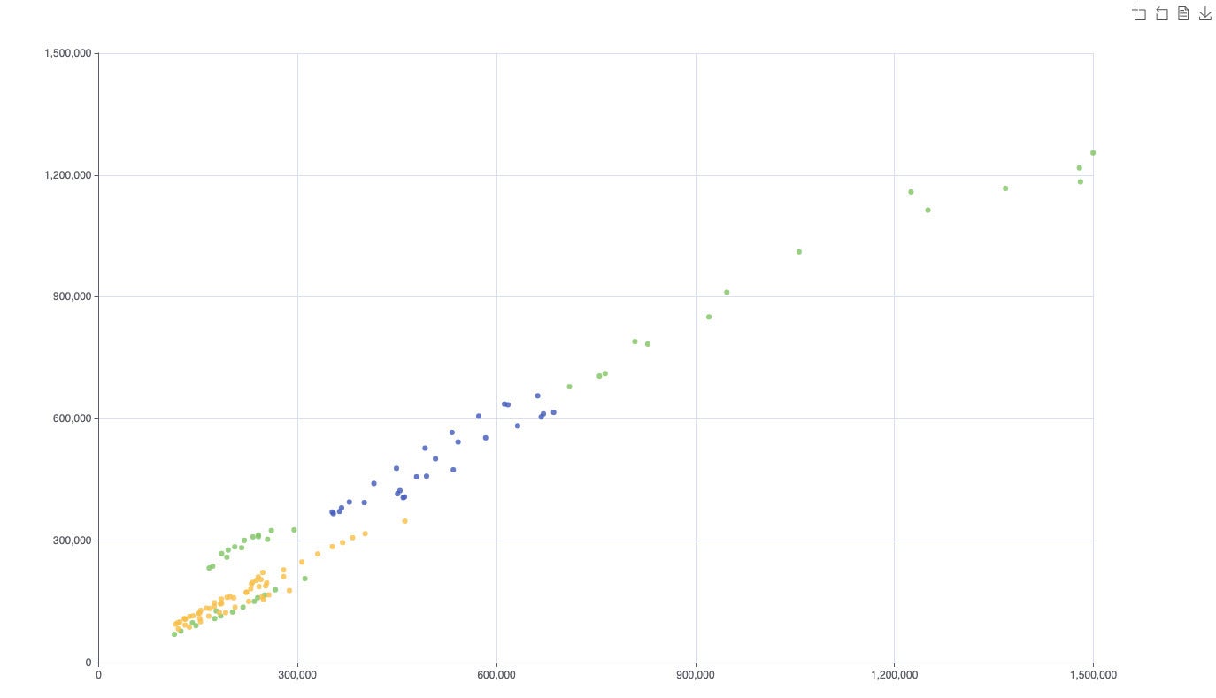 Screen shot by Sharon Machlis, IDG
There are several statistical functions available, including regression lines and error bars, such as e_lm(Condo ~ SingleFamily, color = "green") to add a linear regression line.
Animations with echarts4r
I’ll wrap up our echarts4r tour with some easy animations.
For these demos, I'll use data from the US CDC on vaccinations by state: doses administered compared to vaccine doses received, to see which states are doing the best job of getting vaccines they have into people’s arms quickly. The column I want to graph is PctUsed. I also added a color column if I want to highlight one state with a different color, in this case Massachusetts.
You can download the data from GitHub:
mydata <- readr::read_csv("https://gist.githubusercontent.com/smach/194d26539b0d0deb9f6ac5ca2e7d49d0/raw/f0d3362e06e3cb7dbfc0c9df67e259f1e9dfb898/timeline_data.csv")str(mydata) spec_tbl_df [112 × 7] (S3: spec_tbl_df/tbl_df/tbl/data.frame) $ State : chr [1:112] "CT" "MA" "ME" "NH" ... $ TotalDistributed : num [1:112] 740300 1247600 254550 257700 3378300 ... $ TotalAdministered: num [1:112] 542414 806376 178449 166603 2418074 ... $ ReportDate : Date[1:112], format: "2021-02-08" "2021-02-08" "2021-02-08" "2021-02-08" ... $ Used : num [1:112] 0.733 0.646 0.701 0.646 0.716 ... $ PctUsed : num [1:112] 73.3 64.6 70.1 64.6 71.6 62.7 77.8 72.1 62.5 70.1 ... $ color : chr [1:112] "#3366CC" "#003399" "#3366CC" "#3366CC"
Below is code for an animated timeline. If I group my data by date, add timeline = TRUE to e_charts() and autoPlay = TRUE to the timeline options function, I create an autoplaying timeline. timeline = TRUE is a very easy way to animate data by time in a bar graph.
In the rest of this next code group, I set the bars to be all one color using the itemStyle argument. The rest of the code is more styling: Turn the legend off, add labels for the bars with e_labels(), add a title with a font size of 24, and leave a 100-pixel space between the top of the graph grid and the top of the entire visualization.
mydata %>%
  group_by(ReportDate) %>% #<<
  e_charts(State, timeline = TRUE) %>% #<<
  e_timeline_opts(autoPlay = TRUE, top = 40) %>% #<<
  e_bar(PctUsed, itemStyle = list(color = "#0072B2"))  %>%
  e_legend(show = FALSE) %>%
  e_labels(position = 'insideTop') %>%
  e_title("Percent Received Covid-19 Vaccine Doses Administered",
          left = "center", top = 5,
          textStyle = list(fontSize = 24)) %>%
  e_grid(top = 100)
Run the code on your own system if you want to see an animated version of this static chart:
 Screen shot by Sharon Machlis, IDG
Static image of an animated echarts4r timeline.
Animating a line chart is as easy as adding the e_animation() function. Charts are animated by default, but you can make the duration longer to create a more noticeable effect, such as e_animation(duration = 8000):
mydata %>%
  group_by(State) %>%
  e_charts(ReportDate) %>%
  e_line(PctUsed) %>%
  e_animation(duration = 8000)
I suggest you try running this code locally, too, to see the animation effect.
Racing bars
Racing bars are available in echarts version 5. At the time this article was published, you needed the GitHub version of echarts4r (the R package) to use echarts version 5 features (from the JavaScript library). You can see what racing bars look like in my video below:
This is the full code:
mydata %>%
  group_by(ReportDate) %>%
  e_charts(State, timeline = TRUE) %>%
  e_bar(PctUsed, realtimeSort = TRUE, itemStyle = list(
    borderColor = "black", borderWidth = '1')
  ) %>%
  e_legend(show = FALSE) %>%
  e_flip_coords() %>%
  e_y_axis(inverse = TRUE)  %>%
  e_labels(position = "insideRight",
           formatter = htmlwidgets::JS("
      function(params){
        return(params.value[0] + '%')
      }
    ") ) %>%
  e_add("itemStyle", color) %>%
  e_timeline_opts(autoPlay = TRUE, top = "55")  %>%
  e_grid(top = 100) %>%
  e_title(paste0("Percent Vaccine Dose Administered "),
          subtext = "Source: Analysis of CDC Data",
          sublink = "https://covid.cdc.gov/covid-data-tracker/#vaccinations",
          left = "center", top = 10)
Racing bars code explainer
The code starts with the data frame, then uses dplyr’s group_by() to group the data by date — you have to group by date for timelines and racing bars.
Next, I create an e_charts object with State as the x axis, and I include timeline = TRUE, and add e_bar(PctUsed) to make a bar chart using the PctUsed column for y values. One new thing we haven't covered yet is realtimeSort = TRUE.
The other code within e_bar() creates a black border line around the bars (not necessary, but I know some people would like to know how to do that). I also turn off the legend, since it’s not helpful here.
The next line, e_flip_coords(), changes the graph from vertical to horizontal bars. e_y_axis(inverse = TRUE) sorts the bars from highest to lowest.
The e_labels() function adds a value label to the bars at the inside right position. All the formatter code uses JavaScript to make a custom format for how the labels appear — in this case I’m adding a percent sign. That’s optional.
Label and tooltip formatting
The format syntax is useful to know, because you can use the same syntax to customize tooltips. params.value[0] is the x-axis value and params.value[1] is the y-axis value. You concatenate values and strings together in JavaScript with the plus sign. For example:
formatter = htmlwidgets::JS("
      function(params){
        return('X equals ' + params.value[0] + 'Y equals' + params.value[1])
      }
There’s more information about formatting tooltips on the echarts4r site.
The e_add("itemStyle", color) function is where I map the colors in my data’s color column to the bars, using itemStyle. This is quite different from ggplot syntax and may take a little getting used to if you’re a tidyverse user.
Finally, I added a title and subtitle, a clickable URL for the subtitle, and some padding around the graph grid and the headline so they didn’t run into each other. Run this code, and you should have racing bars.
More resources
For more on echarts4r, check out the package website at https://echarts4r.john-coene.com and the echarts JavaScript library site at https://echarts.apache.org. And for more R tips and tutorials, head to my Do More With R page!