


Last week we took a first look at React-vis, the open-source charting library, and built up our first bar chart using the City of New York Popular Baby Names data set. This week, we’ll expand on our initial example and show how we can begin to incorporate basic interactions. As a refresher, our data set includes rows of data that look like this:
{
  "Year of Birth": "2016",
  "Gender": "FEMALE",
  "Ethnicity": "ASIAN AND PACIFIC ISLANDER",
  "Child's First Name": "Olivia",
  "Count": "172",
  "Rank": "1"
}
The first visualization we built was a bar chart that showed the total number of children's names accounted for in the data by year, which looked like this:
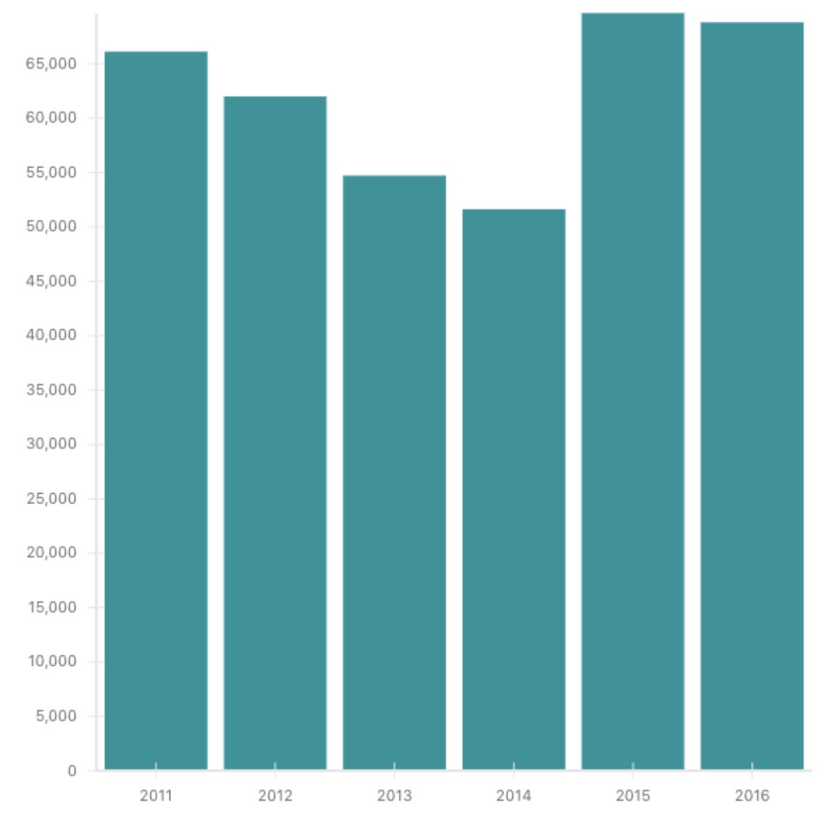 IDG
IDGFor our next visualization, let’s see if we can map the popularity of a name over time. To start off, we’ll build a simple line chart using the LineMarkSeries component. In order to get the popularity of the name Olivia over time, we can use the same filtering logic we used to get yearly totals if we add a filtering step ahead of time:
    const oliviaData = data.filter(d => d.firstName === 'Olivia');
    const oliviasByYear = Object.entries(oliviaData.reduce((acc, row) => {
      if(row.yearOfBirth in acc) {
        acc[row.yearOfBirth] = acc[row.yearOfBirth] + row.count
      } else {
        acc[row.yearOfBirth] = row.count
      }
      return acc;
    }, {})).map(([k, v]) => ({x: +k, y: v}));
The logic above that calculates oliviasByYear is the same logic we used for totalBabiesByYear; we just filtered the data first. When it comes to showing this data in a line chart, substituting a LineMarkSeries component for our VerticalBarSeries component is all we have to do.
 IDG
IDGThis isn’t all that interesting by itself, so let’s add a bit of data to make this visualization more meaningful. Typically we would want to add other data to provide relative comparisons, i.e., charting other names alongside Olivia. To do this, I’ve done a bit of crunching to get the top 10 most popular names in the data set and abstracted the code we used to get the popularity of Olivia over time:
const getPopularityByYearForName = (data, name) => {
  const nameData = data.filter(d => d.firstName === name);
  return Object.entries(nameData.reduce((acc, row) => {
    if(row.yearOfBirth in acc) {
      acc[row.yearOfBirth] = acc[row.yearOfBirth] + row.count
    } else {
      acc[row.yearOfBirth] = row.count
    }
    return acc;
  }, {})).map(([k, v]) => ({x: +k, y: v}));
};

// Later in our processing code:
    const popularNames = ["Liam", "Jacob", "Dylan", "Ethan", "David", "Aiden", "Noah", "Matthew", "Olivia", "Emma"];
    const namesWithData = popularNames.map(name => ({name, data: getPopularityByYearForName(data, name)}));
The code above gives us a list of objects that include a name and yearly popularity data:
  {
    "name": "Olivia",
    "data": [
      {
        "x": 2013,
        "y": 297
      },
      {
        "x": 2014,
        "y": 96
      },
      {
        "x": 2015,
        "y": 589
      },
      {
        "x": 2016,
        "y": 559
      }
    ]
  }
We can then use this list in the rendering of our component. Instead of hardcoding our LineMarkSeries data property with the oliviasByYear data, we can simply map over the list we created and dynamically add a LineMarkSeries for each element in the array:
        <XYPlot
          width={1200}
          height={600}
          margin={{
            left: 70
          }}
          xType="ordinal"
        >
          {namesWithData.map(({name, data}) => (<LineMarkSeries
            key={name}
            data={data}
          />))}
          <XAxis />
          <YAxis />
        </XYPlot>
I’ve also made the visualization twice as wide so that it looks a bit better:
 IDG
IDGNow we have the top 10 popular names over time, but how can we tell which is which? We’ll add a little interaction so that when we hover over a particular line, it will show us the name. The React-vis library provides a Hint component that handles tooltips, but we’ll need to set up a bit of boilerplate in order to use the component. First, we’ll add a field to our component’s state in order to track what data point, if any, should be shown in the hint text:
    this.state = {
      data: [],
      hoverData: null,
    };
Next, we’ll conditionally render our Hint component if that field is set:
        <XYPlot /* existing properties */>
          /* existing components */
          {hoverData && <Hint value={hoverData} />}
        </XYPlot>
All we need to do now is to set an element in state when we hover over it and clear it out when we stop hovering:
        <XYPlot
          /* existing properties */
          onMouseLeave={() => this.setState({hoverData: null})}
        >
          {namesWithData.map(({name, data}) => (<LineMarkSeries
            onValueMouseOver={(d) => this.setState({hoverData: d})}
            key={name}
            data={data}
          />))}
          /* existing components */
        </XYPlot>
 IDG
IDGIt’s not the most ideal chart, but we’ve made a ton of progress. Next week we’ll look at adding animations to our visualizations to create a more engaging user experience. As always, the code is available on GitHub and you can continue the conversation on Twitter: @freethejazz.