


Data visualization is an important part of telling stories, but you can get lost in the weeds with D3.js for hours just to make a few simple charts. If charts are all you need, there are plenty of libraries that wrap D3 and provide you with convenient ways to build simple visualizations. This week, we’ll start to look at React-vis, a charting library that Uber created and open-sourced.
React and d3.js have an interesting relationship. React is all about declarative rendering of components and D3.js is all about imperatively manipulating DOM elements. Using them together is possible using refs, but it’s much nicer to encapsulate all of the manipulation code in a separate component so you don’t have to switch contexts as much. Luckily, the React-vis library already does that for us with a bunch of composable components we can use to build our visualizations.
The best way to test out data visualization libraries, or any library really, is by building something with it. Let’s do that, using the City of New York’s Popular Baby Names data set.
Preparing the data for React-vis
To start, I’ve bootstrapped a React project with create-react-app and added a few dependencies: react-vis, d3-fetch to help pull in the CSV data, and moment to help with date formatting. I also put together a bit of boilerplate code to pull in and parse the CSV that includes the popular names using d3-fetch. In JSON format, the data set we’re pulling in has about 11,000 rows and each entry looks like this:
{
  "Year of Birth": "2016",
  "Gender": "FEMALE",
  "Ethnicity": "ASIAN AND PACIFIC ISLANDER",
  "Child's First Name": "Olivia",
  "Count": "172",
  "Rank": "1"
}
Because the spaces in the keys and the numbers represented as strings would make this data inconvenient to work with, we’ll modify the data at load time to do some massaging. That code simply uses the dsv method from d3-fetch:
import { dsv } from 'd3-fetch';
import moment from 'moment';
dsv(",", dataUrl, (d) => {
  return {
    yearOfBirth: +d['Year of Birth'],
    gender: d['Gender'],
    ethnicity: d['Ethnicity'],
    firstName: d['Child\'s First Name'],
    count: +d['Count'],
    rank: +d['Rank'],
  };
});
Now our input data is a lot friendlier. It looks like this:
{
  "yearOfBirth": 2016,
  "gender": "FEMALE",
  "ethnicity": "ASIAN AND PACIFIC ISLANDER",
  "firstName": "Olivia",
  "count": 172,
  "rank": 1
}
Our first plot with React-vis
The first component you’ll probably be using is some form of an XYPlot, which contains other components and is present in almost every chart you build. This is mostly just a wrapper that defines the size of the visualization, but it can include some properties that get passed to children as well. By itself, XYPlot doesn’t render anything but some empty space:
<XYPlot
  width={300}
  height={300}
>
</XYPlot>
To actually show data, we’ll need to use a series of some sort. A series is the component that actually draws the data, such as a vertical bar chart (VerticalBarSeries) or a line chart (LineSeries). We have 14 series at our disposal out of the box, but we’ll start with a simple VerticalBarSeries. Each series inherits from a base set of attributes. The most useful one for us will be the data attribute:
<XYPlot
  width={300}
  height={300}
>
  <VerticalBarSeries
    data={data}
  />
</XYPlot>
This is going to fail, though, because React-vis expects the elements in the data array to be in the following shape:
{
  x: 2016,  // This will be mapped to the x-axis
  y: 4         // This will be mapped to the y-axis
}
For example, to show the total number of babies counted in the data set by year, we’ll need to process the data to get a single object for each year where the x attribute is the year and the y attribute is the total number of babies in the data set. The code I wrote to do that is fairly terse:
const totalBabiesByYear = Object.entries(data.reduce((acc, row) => {
  if(row.yearOfBirth in acc) {
    acc[row.yearOfBirth] = acc[row.yearOfBirth] + row.count
  } else {
    acc[row.yearOfBirth] = row.count
  }
  return acc;
}, {})).map(([k, v]) => ({x: +k, y: v}));
When you plug it into the VerticalBarSeries, we get some results!
 IDG
IDGThis isn’t particularly helpful on its own, but luckily the React-vis library provides some additional components that can be used to contextualize the information. Let’s import XAxis and YAxis so we can display more information in our chart. We’ll render those components inside the XYPlot alongside our VerticalBarSeries. The code and results look like this:
<XYPlot
  width={600}
  height={600}
>
  <VerticalBarSeries
    data={totalBabiesByYear}
  />
  <XAxis />
  <YAxis />
</XYPlot>
 IDG
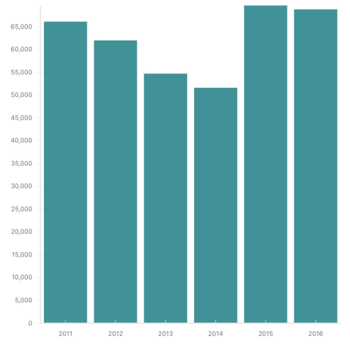
IDGOur y-axis labels are cut off and our x-axis labels are being formatted as numbers, but we’re making progress. To get the x-axis treated as discrete ordinal values as opposed to a continuous numeric range, we’ll add xType="ordinal" as a property on the XYPlot. While we’re at it, we can add some left margin to the chart so we can see more of the y-axis labels:
<XYPlot
  width={600}
  height={600}
  margin={{
    left: 70
  }}
  xType="ordinal"
>
 IDG
IDGWe’re in business! Our chart already looks great—and most of the work we had to do related to massaging data, not actually rendering it.
Next week, we’ll continue exploring the React-vis library components and define some basic interactions. Check out this project on GitHub if you want to play around with the data set and the React-vis library. Got any visualizations you made with React-vis? Send me a screenshot on Twitter @freethejazz.