


![Tech Spotlight > IT Leadership [intro] > One glowing arrow leads a pack of other arrows.](https://images.idgesg.net/images/idge/imported/imageapi/2022/03/02/10/spot_it_leadership_2021_intro_one_glowing_arrow_leads_a_pack_of_other_arrows_forward_leadership_momentum_progress_growth_by_gremlin_gettyimages-1050942106_2400x1600_homepage_hero-100870924-large-100920689-large.jpg?auto=webp&quality=85,70)
Lit is one of the more interesting front-end JavaScript frameworks for reactive programming. It’s caught quite a bit of interest from developers, but remains relatively under the radar compared to other reactive frameworks. Lit is built on top of the Web Components standard and prioritizes speed and a small set of useful features.
Building web components with Lit
There are several ways to get started with a Lit project. For this tutorial, we’ll use a starter template. You’ll need a command line with Git and Node.js (npm) installed.
Note: Because it is based on Web Components, Lit uses the Shadow DOM to achieve reactivity.
Go to the command line and type git clone https://github.com/lit/lit-element-starter-js.git. This command deploys a simple example project into the lit-element-starter-js directory. cd into that directory and install the dependencies with npm install.
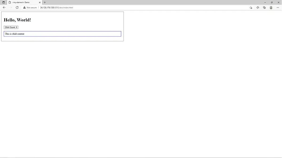
Now, you can run the application with npm run serve. If you visit localhost:8000, you’ll see the application running with the screen shown in Figure 1. (Clicking the Count button increases the count.)
 IDG
IDG
Figure 1. The Lit starter app
Reactivity in the Lit framework
Next, let’s look at how Lit is laid out and how it achieves reactivity.
The main work happens in /dev/index.html, as shown in Listing 1.
Listing 1. Reactivity in Lit
<html>
<head>
<meta charset="utf-8" />
<title><my-element> Demo</title>
<script src="../node_modules/@webcomponents/webcomponentsjs/webcomponents-loader.js"></script>
<script src="../node_modules/lit/polyfill-support.js"></script>
<script type="module" src="../my-element.js"></script>
<style>
p {
border: solid 1px blue;
padding: 8px;
}
</style>
</head>
<body>
<my-element>
<p>This is child content</p>
</my-element>
</body>
</html>
The main thing to note is that the page imports a Polyfill library to ensure the browser will understand Web Components. It also imports a library to assist with loading Web Components via npm. Finally, it imports a custom module, my-element.js, from the parent directory.
Next, take a look at my-element.js in Listing 2, which contains all the fundamental elements of a lit component.
Listing 2. Elements of a Lit-based component
import {LitElement, html, css} from 'lit';
/**
* An example element.
*
* @fires count-changed - Indicates when the count changes
* @slot - This element has a slot
* @csspart button - The button
*/
export class MyElement extends LitElement {
 static get styles() {
   return css`
     :host {
       display: block;
       border: solid 1px gray;
       padding: 16px;
       max-width: 800px;
     }
   `;
 }
 static get properties() {
   return {
     /**
      * The name to say "Hello" to.
      * @type {string}
      */
     name: {type: String},
     /**
      * The number of times the button has been clicked.
      * @type {number}
      */
     count: {type: Number},
   };
 }
 constructor() {
   super();
   this.name = 'World';
   this.count = 0;
 }

 render() {
   return html`
     <h1>${this.sayHello(this.name)}!</h1>
     <button @click=${this._onClick} part="button">
       Click Count: ${this.count}
     </button>
     <slot></slot>
   `;
 }
 _onClick() {
   this.count++;
   this.dispatchEvent(new CustomEvent('count-changed'));
 }
 /**
  * Formats a greeting
  * @param name {string} The name to say "Hello" to
  * @returns {string} A greeting directed at `name`
  */
 sayHello(name) {
   return `Hello, ${name}`;
 }
}
window.customElements.define('my-element', MyElement);
The first thing to note is that lit extends the LitElement base class. You might also observe that the styles() and properties() methods are both static getter methods. We don’t have to worry about the signatures; we just use them to define the characteristics of our components.
The styles() method returns the CSS for the component, and properties() returns the properties. styles() uses the css method from Lit to define component-scoped CSS in a template literal. properties() exposes the component's reactive variables: name and count. In each case, the object returned defines the variable type in the property (for example, name: {type: “String”}).
Property values
Notice that the properties are given default values in the constructor. These are public properties, so you could comment out the name definition, for instance, and then in /dev/index.html, give the name property a value via its parent, as shown in Listing 3.
Listing 3. Public property value
<body>
   <my-element name="Galadriel">
     <p>This is child content</p>
   </my-element>
 </body>
The pattern in Listing 3 is common among reactive frameworks, allowing for the one-way, downward flow of state from parent to child.
Rendering the component
Next up is the render method, which returns view markup via the html() method and a template literal. The syntax used in the literal string is tagged literals. Notice that this method has full access to both of the properties we saw earlier (name and count), as well as methods defined on the component object, which are defined next.
Built in and custom methods
Lit has two kinds of methods: built-in and custom. The _onClick() method is built in, meaning it has special meaning for the framework. When Lit sees this method, it defines the onclick handler for the given component. In this case, it simply increments the count variable.
The second method is sayHello(name), which is a custom method called from within the view markup. Notice that this method has full access to the variables which can be passed in as arguments:
<h1>${this.sayHello(this.name)}!</h1>
All properties and methods are accessed via the this keyword; that is, they are members of the object.
Registering the component
Finally, the component calls out to the browser to register itself as a web component.
As with other reactive frameworks, Lit encourages you to write one-way code, where the template simply reflects state changes without modifying the state or DOM directly.
Slots and child elements
The Web Components standard uses slots. In our example, you can see that the component itself defines a <slot></slot> and the parent that passes in a child element (<p>This is child content</p>) that will be put into the slot.
Show and hide elements
Lit includes a variety of useful expressions, like the ability to show and hide elements.
For example, if you wanted to show an element when the counter exceeded 5, you could use something like what's shown in Listing 4.
Listing 4. Show and hide elements
return html`
     <h1>${this.sayHello(this.name)}!</h1>
     <div ?hidden=${this.count<5}>Not hidden</div>
     <button @click=${this._onClick} part="button">
       Click Count: ${this.count}
     </button>
     <slot></slot>
   `;
Adding functionality in Lit
Now let’s add some functionality to the example. How about displaying collections? Take a look at Listing 5.
Listing 5. Iterating over an array in Lit
static get properties() {
   return {
     name: {type: String},
     count: {type: Number},
     hobbits: []
   };
 }
 constructor() {
   super();
   this.hobbits = ["Frodo","Sam","Merry","Pippin"];
 }
 render() {
   return html`
     <h1>${this.sayHello(this.name)}!</h1>
     <div ?hidden=${this.count<5}>Not hidden</div>
     <button @click=${this._onClick} part="button">
       Click Count: ${this.count}
     </button>
     <ul>
       ${this.hobbits.map((color) =>
         html`<li style="color: ${color}">${color}</li>`
       )}
     </ul>
     <slot></slot>
   `;
 }
Listing 5 shows how you add a hobbit property, initialize it with the four most famous hobbits, and then iterate over them using a map in the render function. You might notice that React handles this sequence very similarly. You can also extract your looping logic into a function that you call from inside the template as described here.
Note: Lit also supplies a repeat directive, which you can use to efficiently handle list state changes in certain situations.
Making Lit API calls with until
Now let’s get a look at making a remote API call. We’ll use the Lord of the Rings API to get a list of all known hobbits. You’ll also need to grab an auth token, which is free and quick.
Lit has an until directive that lets you display alternate content while awaiting the resolution of a promise. First, add that import to the head of your my-element.js: import {until} from 'lit/directives/until.js';.
Next, add the remoteHobbits to the constructor: this.remoteHobbits = getRemoteHobbits();.
Third, add the output to the render method like so:
${until(this.remoteHobbits, html`<span>Awaiting remote hobbits...</span>`)}
Notice that here we are using until to display a loading message while we await the resolution of the promise of remoteHobbits.
Take a look at the promise definition in getRemoteHobbits(), shown in Listing 6.
Listing 6. getRemoteHobbits
const getRemoteHobbits = async () => {
 const response = await fetch("https://the-one-api.dev/v2/character?race=Hobbit",
   {
     "headers": {
       "Authorization":"Bearer <YOUR API TOKEN HERE>"
     }
   }
 );
 const json = await response.json();
 const hobbits = [];
 for (const h of json.docs){
   hobbits.push(html`<li>${(h.name)}</li>`);
 }
 return hobbits;
}
Listing 6 uses a normal fetch call to get the list of characters, filtered by race=Hobbit. Note that you need to supply your API token in the Authorization header.
Finally, you marshal the JSON response into a set of list items, and return that for insertion into the HTML template.
Now, the UI will display the collection of hobbits from the remote API.
You can find the source for this demonstration in my GitHub repository.