


There are lots of ways to share results of your R analysis: Word documents, interactive apps, even in the body of an email.
But sometimes, you want a slide presentation. It’s easy to generate a PowerPoint file from your R code – complete with charts and graphs – directly from an R Markdown document.
Create a PowerPoint from R Markdown
To create a PowerPoint from R, you need three things on your system:
- PowerPoint or OpenOffice,
- The rmarkdown package, version 1.9 or later, and
- Pandoc version 2.0.5 or newer.
Pandoc isn’t an R package. It’s not R at all; it’s a separate piece of open source software designed for file format conversions.
RStudio ships with Pandoc, so you probably have a version of it installed if you use RStudio. You can run the rmarkdown package’s pandoc_version() function to see if you’ve got it installed and, if so, what version. If your pandoc is too old, try updating RStudio (or install pandoc directly from pandoc.org).
 Sharon Machlis, IDG
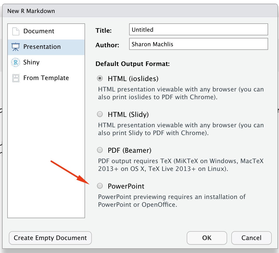
There is an option to create a PowerPoint file from R Markdown when you create a new markdown file in RStudio.
Next, create an R Markdown document. If you do that from RStudio’s menu with File > New File > R Markdown, you’ll have a few choices. If you click on the second choice, Presentation, you should see an option for PowerPoint under Default Output Format.
The resulting R Markdown file created by RStudio includes examples for mixing text and R code results. If you save that file and then “knit” it by clicking the knit button in RStudio, you'll get a PowerPoint presentation with the same information.
How did R know where to break the content into new slides? The default is “the highest level of headline that’s not followed immediately by another headline.” In this case that’s headline level two, or all titles starting with ##.
You don’t need to use that default rule, though. You can specify another headline level to auto-divide your document into new slides. That’s done in the doc’s YAML header with the slide_level option, such as
output:
  powerpoint_presentation:
    slide_level: 3
But if you don’t want to fiddle with all that, you can divide content into new slides manually with three dashes. Make sure the three dashes are on a completely new line.
Presenting the weather
Here is an R Markdown file that’s a bit more interesting than the default doc, at least for me: One with weather data.
---
title: "National Weather Service Temperature Forecasts"
subtitle: "Boston, San Francisco, and Honolulu"
author: "Sharon Machlis"
date: "`r format(Sys.Date(), '%B %e, %Y')`"
output:
  powerpoint_presentation:
    reference_doc: CorporateStyle.pptx
---
```{r setup, include=FALSE}
knitr::opts_chunk$set(echo = FALSE, warning = FALSE, message = FALSE, fig.width = 10, cache = TRUE)
pacman::p_load(ggplot2, jsonlite, httr, dplyr)
source("https://gist.githubusercontent.com/smach/897ee745d0cbcac6160952cc8f9da8fc/raw/6c14585a47d9a91ebb8dbc1d871281928a9da42a/wx_slideshow_functions.R")
```
## Boston
```{r}
bos_data <- get_forecast_data("Boston", "https://api.weather.gov/gridpoints/BOX/70,75/forecast")
get_forecast_graph(bos_data)
```
## San Francisco
```{r}
sf_data <- get_forecast_data("San Francisco", "https://api.weather.gov/gridpoints/MTR/88,126/forecast")
get_forecast_graph(sf_data)
```
## Honolulu
```{r}
hi_data <- get_forecast_data("Honolulu", "https://api.weather.gov/gridpoints/HFO/153,144/forecast")
get_forecast_graph(hi_data)
save(bos_data, sf_data, hi_data, file = "wxdata.Rdata")
```
Notice the R chunk options I’ve set. echo = FALSE means my R code won’t show up in my slides. warning and message set to FALSE makes sure any warnings or messages from my code don’t appear in the slides either. I’ve also set a default figure width and cache = TRUE . (I don’t usually cache results for a file I want to update regularly, but I did so to save time on the accompanying video.)
Get National Weather Service forecast data via R
My R Markdown setup code chunk also sources a separate file on GitHub that includes two functions for fetching weather data. Here is that code, if of interest:
get_forecast_data <- function(city, forecast_url) {
  req<-httr::GET(forecast_url)
  json <- httr::content(req, as = "text")
  weather_data <- jsonlite::fromJSON(json)
  forecast_df <- weather_data$properties$periods
  forecast_df <- forecast_df %>%
    dplyr::mutate(
      City = city,
      Temp = if_else(isDaytime == TRUE, "High", "Low"),
      Date = as.Date(substr(startTime,1,10)),
      Day = factor(name, levels = unique(name), ordered = TRUE)
    )
  Sys.sleep(2)
  return(forecast_df)
}

get_forecast_graph <- function(forecast_df) {
    ggplot(forecast_df, aes(x = Date, y = temperature, group = Temp, color = Temp)) +
    geom_line() +
    theme_minimal() +
theme(panel.border = element_blank(), panel.grid.major = element_blank(),
panel.grid.minor = element_blank(), axis.line = element_line(colour = "gray")) +
    ylab("") + xlab("")
}
The first function pulls a forecast data frame from the National Weather Service API using the city name and the city’s forecast URL as function arguments.
You need to know the API’s forecast URL for a location in order to get its forecast data. If you don’t know that URL, you can get it from another National Weather Service API using the format
https://api.weather.gov/points/{latitude},{longitude}The initial API result from the httr GET request is a list. The function adds code that returns only the portion of the list with the data I want, formatted as a data frame.
The second function takes that forecast data frame and generates a ggplot line graph for high and low temperatures.
Change the PowerPoint default font
If you want a different default font or font size for your R-generated slides, you can set those with a reference PowerPoint document and add info about that document in the R Markdown YAML header. I did that for these slides, as you can see in this portion of the YAML document header:
output:
  powerpoint_presentation:
    reference_doc: CorporateStyle.pptx
My reference file, CorporateStyle.pptx, is a regular PowerPoint file and not a PowerPoint template. To turn it into a reference file, I went into the file’s Master Slide view and set some styles. You can edit any PowerPoint file’s Master Slide view in the PowerPoint menu with View > Slide Master.
Whenever I want an updated version of that forecast PowerPoint, I just need to re-knit the document. I could even set this up to run automatically using Windows scheduler or launchd on a Mac.
Create HTML slides from R
There might be many times when you specifically need or want a PowerPoint file. One thing PowerPoint slides lack, though, is interactivity. For example, you can’t roll over a graph and see underlying data.
You could if these were HTML slides, though.
There are a few ways to generate HTML slides from R. One of the most popular is with the xaringan R package. xaringan is built on top of the remark.js JavaScript library. There is a bit of a learning curve to do more than the basics, but the look and feel are extremely customizable.
xaringan would need its own series to cover all you can do with it. But even basics can work for a lot of use cases. Below is an example of an R Markdown document with just a bit of customization.
---
title: "National Weather Service Temperature Forecasts"
subtitle: "Boston, San Francisco, and Honolulu"
author: "Sharon Machlis"
date: "`r format(Sys.Date(), '%B %e, %Y')`"
output:
  xaringan::moon_reader:
    lib_dir: libs
    nature:
      highlightStyle: github
      highlightLines: true
      countIncrementalSlides: false
---
class: center
layout: true
---
```{r setup, include=FALSE}
knitr::opts_chunk$set(echo = FALSE, warning = FALSE, message = FALSE, fig.width = 10)
pacman::p_load(echarts4r, dplyr)
load("wxdata.Rdata")
get_interactive_graph <- function(wxdata) {
  mygraph <- wxdata %>%
    group_by(Temp) %>%
    mutate(Date = format(Date, "%b %e")) %>%
    e_charts(Date) %>%
    e_line(temperature) %>%
    e_tooltip(trigger = "axis")
  return(mygraph)
}
```
## Boston
```{r}
get_interactive_graph(bos_data)
```

---
## San Francisco
```{r}
get_interactive_graph(sf_data)
```

---
## Honolulu
```{r}
get_interactive_graph(hi_data)```
---
# [bit.ly/domorewithR](https://bit.ly/domorewithR)
Three dashes create a new slide. That first slide after the title slide won’t display; it’s setting defaults for the other slides. layout: true means “this is a slide setting up layout defaults.” class: center centers everything – header text, graphics – unless I specifically code it otherwise.
The xaringan::moonreader output option regenerates the slides each time you save the file so you don’t need to click the knit button.
The body of the file includes a graphing function I wrote using one of my favorite dataviz packages, echarts4r, to visualize my weather data. You can hover over lines on the graphs in these slides to see underlying data, as well as click legend items to turn lines off and on.
 Sharon Machlis
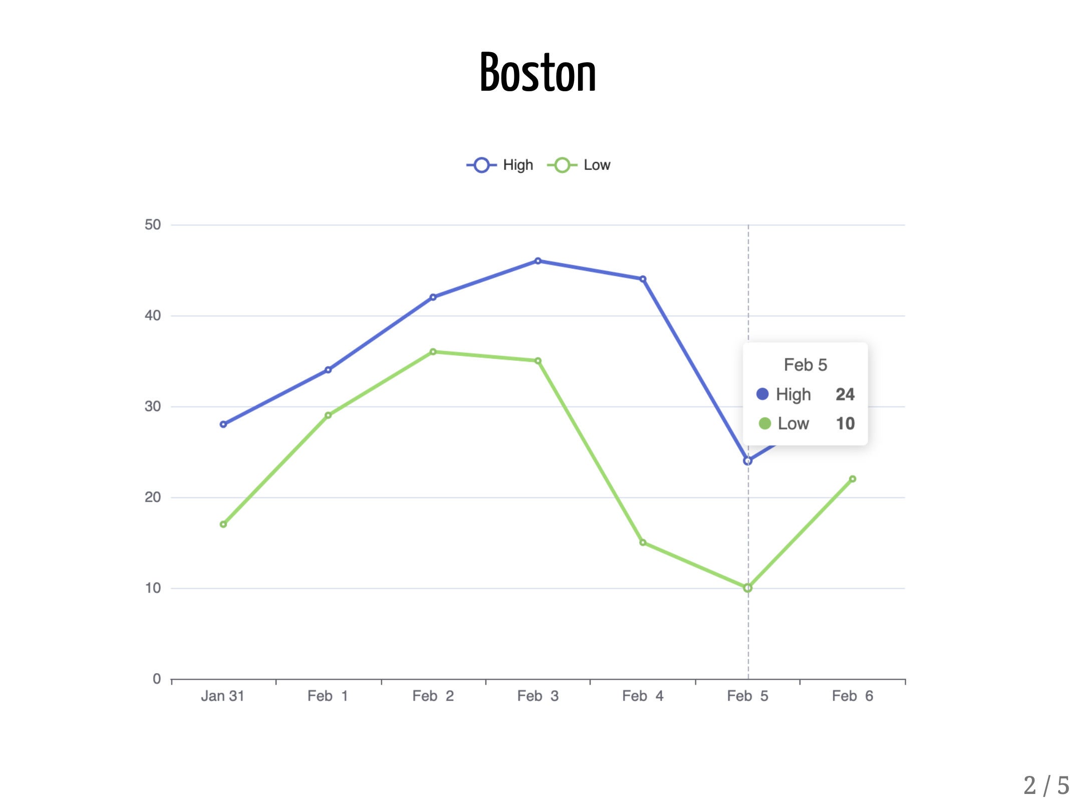
An HTML slide presentation lets you interact with visualizations, such as hovering over a graph to see underlying data.
There is a ton more you can do with xaringan, from adding your own CSS file to creating your own theme to animating slides. Here are some resources to learn more:
- xaringan slide presentation about xaringan by creator Yihui Xie
- Incremental slides with xaringan by creator Yihui Xie
- xaringan presentations from R Markdown: the Definitive Guide by Yihui Xie, J. J. Allaire, and Garrett Grolemund
- xaringan gallery of examples and themes by Emil Hvitfeldt
- Meet xaringan: Making slides in R Markdown by Alison Hill (RStudio Conference 2019 workshop slides)
- xaringanExtra package (enhancements and extensions to the xaringan package) by Garrick Aden-Buie
- xaringanthemer package (lots of xaringan styling options) by Garrick Aden-Buie
And for more R tips, head to the Do More With R page.