


Drill-down visualizations can be a good way to present a lot of data in a digestible format. In this example, we’ll create a graph of median home values by U.S. state using R and the highcharter package.
 Sharon Machlis, IDG
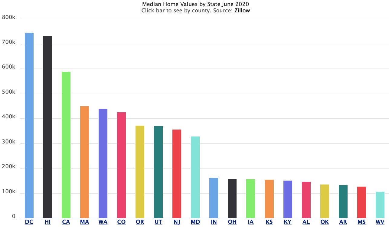
Initial graph of median home values by state (highest and lowest 10 states). Data from Zillow.
Each state’s bar will be clickable — the drilldown — to see data by county.
 Sharon Machlis, IDG
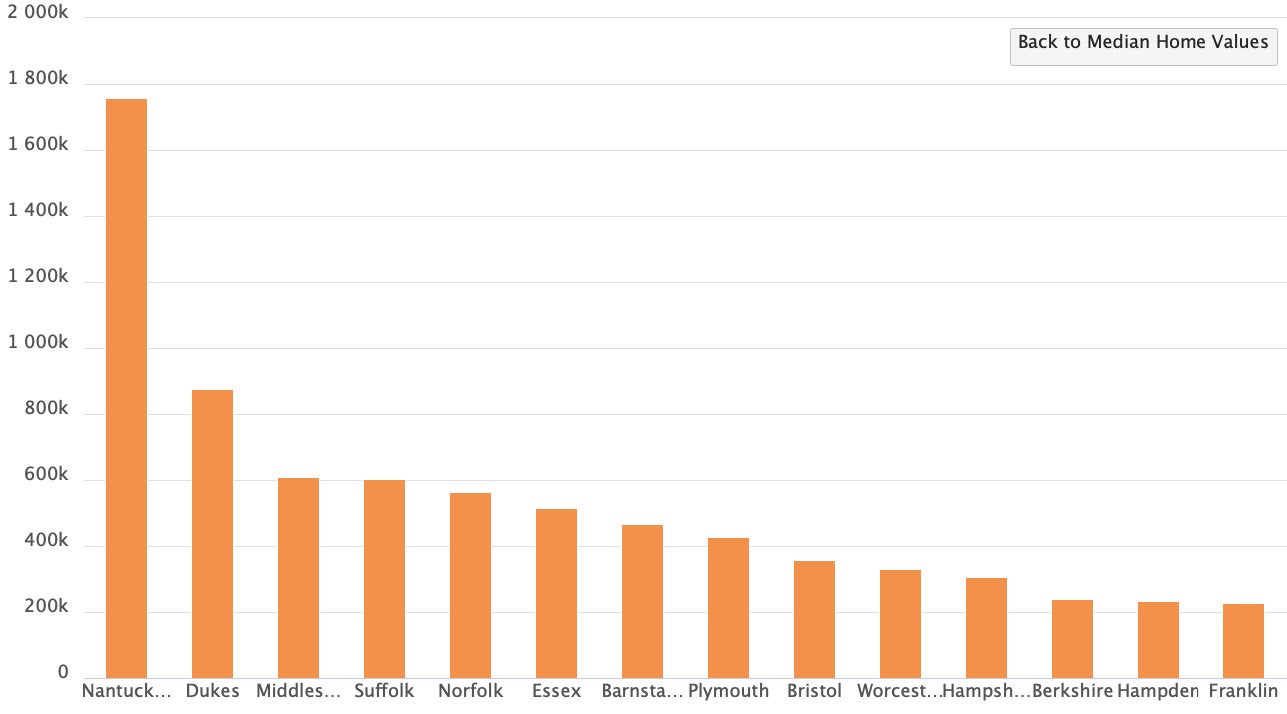
After clicking the bar for Massachusetts, a user sees median home values by Massachusetts county. Data from Zillow.
There are three main steps to making a drill-down graph with highcharter:
- Wrangle your data into the necessary format;
- Create a basic top-level graph; and
- Add the drill-down.
If you want to follow along, download state- and county-level data sets for the Zillow Home Value Index from Zillow at https://www.zillow.com/research/data/. I’m using the ZHVI Single-Family Homes series.
First, load the packages we’ll be using:
library(rio)
library(dplyr)
library(purrr)
library(highcharter)
library(scales)
library(stringr)
All can be installed from CRAN with install.packages() if you don’t already have them on your system.
Note that highcharter is an R wrapper for the Highcharts JavaScript library — and that library is only free for personal, non-commercial use (including testing it locally), or use by non-profits, universities, or public schools. For anything else, including government use, you need to buy a license.
Next, I import the state and county CSV files into R with the following code. (My CSV files are in a data subfolder of my project directory.)
states <- import("data/State_zhvi.csv")
counties <- import("data/County_zhvi.csv")
These files have hundreds of columns, one for each month starting in 1996. I want to graph the most recent data, so I look for the name of the last column with
names(states)[ncol(states)]
At the time I wrote this, that returned 2020-06-30, which I’ll use as my MedianValue column. I’d like to compare that value to the start of the century, so I’ll also include 2020-01-31 as a PriceIn2000 column.
Data wrangling
Here’s my code for creating a latest_states data frame, which I’ll use as a base for the graph:
latest_states <- states %>%
  select(c(State = StateName, MedianValue = `2020-06-30`, PriceIn2000 = `2000-01-31`)) %>%
  arrange(desc(MedianValue)) %>%
  mutate(
    MedianValueFormatted = dollar(MedianValue),
    PriceIn2000Formatted = dollar(PriceIn2000),
    PctChangeFrom2000 = percent((MedianValue - PriceIn2000) / PriceIn2000, accuracy = 1)
  ) %>%
  slice(c(1:10, 42:51))
In addition to selecting and renaming columns, the code above arranges data by descending median value, adds three new columns, and chooses the 10 highest and lowest state rows by MedianValue with slice().
The new columns MedianValueFormatted and PriceIn2000Formatted just add dollar signs and commas to values. I’m only using those to display nicely formatted values in the graph tooltips. You can format values in highcharter using some JavaScript code instead, but I find it easier to do in R. Another new column calculates the percent change from 2000 to the most recent value.
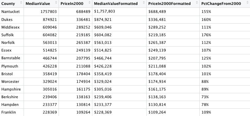
I use largely similar code to create a latest_counties data frame. Here I make sure to filter for rows that include states in my latest_states data. I also remove the word “County” from all the county names to save space on the graph. And, when I arrange by descending median value, I first arrange by state so counties are arranged within each state group.
latest_counties <- counties %>%
select(c(County = RegionName, State = StateName, MedianValue = `2020-06-30`, PriceIn2000 = `2000-01-31`)) %>%
filter(State %in% latest_states$State) %>%
arrange(State, desc(MedianValue)) %>%
group_by(State) %>%
mutate(
County = str_remove(County, " County"),
MedianValueFormatted = dollar(MedianValue),
PriceIn2000Formatted = dollar(PriceIn2000),
PctChangeFrom2000 = percent((MedianValue - PriceIn2000) / PriceIn2000, accuracy = 1)
) %>%
ungroup() %>%
arrange(State, desc(MedianValue))
So far, this is usual R data wrangling. Next, though, I’ll create a special drill-down version of the county data specifically for highcharter.
Data frame for a graph’s drill-down
Take a look at the code below, and then I’ll break down what’s happening.
county_drilldown <- latest_counties %>%
  group_nest(State) %>%
  mutate(
    id = State,
    type = "column",
    data = map(data, mutate, name = County, y = MedianValue),
    data = map(data, list_parse)
  )
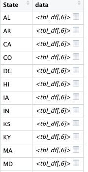
First, I use dplyr’s group_nest() function to create a list column for each state’s row with just that state’s data. The result is a data frame with two columns: state and data. The data column has a data frame for each state’s data by county, such as the one below for Massachusetts:
 Sharon Machlis, IDG
Result of dplyr’s group_nest() function.
 Sharon Machlis, IDG
Each entry in the data column is a data frame with that state’s data by column.
But highcharter needs a little extra data and formatting to create a drill-down. The first two lines of code under mutate() in the above code group add an ID column — how the drilldown connects to the data one level up — and a type column, for the type of highcharter graph I want. The first map() line of code adds two columns to each data frame in the list column: name for the county name and y for the county value.
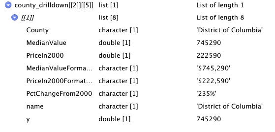
The last line in mutate() uses the highcharter function list_parse() to turn each data frame in the data column into a list with a different format, such as the image below showing a list with information for the District of Columbia.
 Sharon Machlis, IDG
Result of the list_parse() function for District of Columbia data.
Customize the tooltip
My next step is an optional one: Formatting the tooltip. Highcharter’s tooltip_table() function lets you change the default format and add more columns than appear on your graph. This is one of the easiest ways I’ve seen to customize tooltips for an R HTML widget. You create one vector with the category text and another vector with the values, such as
tooltip_category_text <- c("Median Value: ",
"Value in 2000: ",
"Percent change from 2000: ")
tooltip_formatted_values <- c("{point.MedianValueFormatted}",
"{point.PriceIn2000Formatted}",
"{point.PctChangeFrom2000}")
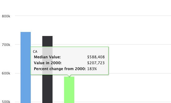
my_tooltips <- tooltip_table(tooltip_category_text, tooltip_formatted_values)That code will produce a tooltip that looks something like the one displayed in the image below.
 Sharon Machlis, IDG
Customized tooltip using highcharter’s tooltip_table() function. Data from Zillow.
Finally, we’re ready to make a graph!
Graph code
hchart() is a highcharter function to make a highchart object with a basic graph. In the code below, hchart() takes as its arguments the data frame, the chart type, and then a ggplot-like aesthetic function. Its options include the x column, the y column, and the drill-down column.
mygraph <- hchart(
  latest_states,
  "column",
  hcaes(x = State, y = MedianValue, name = State, drilldown = State),
  name = "Median Home Values",
  colorByPoint = TRUE
)
hc_drilldown() adds that drilldown.
mygraph <- mygraph %>%
  hc_drilldown(
    allowPointDrilldown = TRUE,
    series = list_parse(county_drilldown)
  )
Note in the code above that the series argument needs list_parse() again.
hc_tooltip() uses the custom tooltip format I created earlier.
mygraph <- mygraph %>%
  hc_tooltip(
    pointFormat = my_tooltips,
    useHTML = TRUE
  ) %>%
  hc_yAxis( title = "") %>%
  hc_xAxis( title = "" ) %>%
  hc_title(text = "Median Home Values by State June 2020" ) %>%
  hc_subtitle(
    text = "Click bar to see by county. Source: <a href='https://www.zillow.com/research/data/'>Zillow</a>",
    style = list(useHTML = TRUE)
  )
The useHTML = TRUE argument makes for a nicer tooltip format. After that, there’s code to remove the x and y axis labels, and to add a title and subtitle.
You can type the name of the graph object in your R console to see it displayed in RStudio or to add the graph to an R Markdown document or Shiny app. You can also use the htmlwidgets package’s saveWidget() function to save the single graph as a self-contained HTML file, such as
library(htmlwidgets)
saveWidget(mygraph, file = "my_drilldown_graph.html",
           selfcontained = TRUE)
Highcharter package author Joshua Kunst has a lot more information about what you can do with highcharter at the highcharter package website.
For more R tips, head to the Do More With R page at https://bit.ly/domorewithR or the Do More With R playlist on the IDG TECHtalk YouTube channel.