


If you’re mapping election results of, say, the US presidential election by state, it can make sense to just show one color of red for states won by Republicans, and one color of blue for states won by Democrats. That’s because it doesn’t matter whether a candidate wins by three thousand votes or three million: It’s “winner take all.”
But when analyzing results of a state election by county, or a city-wide election by precinct, the margin matters. It’s the overall total that decides the winner. Winning “Atlanta” itself isn’t all you need to know when looking at Georgia statewide results for governor, for example. You’d want to know how many votes the Democrat won by, and compare that to other areas.
That’s why I like to create maps that are color-coded by winner and with intensity of color showing margin of victory. That tells you which areas contributed more and which contributed less to the overall result.
In this demo, I’ll use Pennsylvania 2016 presidential results. If you’d like to follow along, download the data and geospatial shapefiles:
I first load some packages: dplyr, glue, scales, htmltools, sf, and leaflet. I’ll use rio to import the data CSV file, so you’ll want that on your system as well.
library(dplyr); library(glue); library(scales);
library(htmltools); library(sf); library(leaflet)
pa_data <- rio::import("pa_2016_presidential.csv")
Data import and prep
Next, I use sf’s st_read() function to import a shapefile of Pennsylvania counties.
pa_geo <- sf::st_read("PaCounty2020_08/PaCounty2020_08.shp",
                       stringsAsFactors = FALSE)
I don’t like the county column name COUNTY_NAM in pa_geo, so I’ll change it to “County” with this code:
names(pa_geo)[2] <- "County"
Before I merge my data with my geography, I want to make sure that the county names are the same in both files. dplyr’s anti_join() function merges two data sets and shows which rows don’t have a match. I’ll save the results in a data frame called problems and look at the first six rows with head() and the first three columns:
problems <- anti_join(pa_geo, pa_data, by = "County")
head(problems[,1:3])

  MSLINK County COUNTY_NUM                       geometry
1     42 MCKEAN         42 MULTIPOLYGON (((-78.20638 4...
There’s one problem row. That’s because McKean County is MCKEAN in this data but McKEAN in the other data frame. I’ll change McKean to be all caps in pa_data and run the anti_join() check again.
pa_data$County[pa_data$County == "McKEAN"] <- "MCKEAN"
anti_join(pa_geo, pa_data, by = "County")
There should now be no problem rows.
The next line of code merges the data with the geography:
pa_map_data <- merge(pa_geo, pa_data, by = "County")
Finally, I’m going to make sure that my new geography and data object uses the same projection as my leaflet tiles do. Projection is a pretty complex GIS topic. For now, just know that I need WGS84 to match leaflet. This code sets my projection:
pa_map_data <- st_transform(pa_map_data, "+proj=longlat +datum=WGS84")
Now that my data is in the shape I need, I have three more tasks: Create color palettes for each candidate, create pop-ups for the map, and then code the map itself.
Color palettes
I’ll start with the palettes.
I’m going to map raw vote differences in this demo, but you might want to use percentage differences instead. The first line in the code below uses base R’s range() function to get the smallest and largest vote differences in the Margin column. I’ve assigned the lightest color to the smallest number, and the darkest to the biggest number.
Next I create two palettes, using the conventional red for Republicans and blue for Democrats. I use the same intensity scale for both palettes: lightest for the lowest margin, regardless of candidate, and highest for the highest margin, regardless of candidate. This will give me an idea of where each candidate was strongest on a single intensity scale. I use leaflet’s colorNumeric() function, with a palette color of Reds or Blues, to create the palettes. (The domain argument sets minimum and maximum values for the color scale.)
min_max_values <- range(pa_map_data$Margin, na.rm = TRUE)
trump_palette <- colorNumeric(palette = "Reds",
                              domain=c(min_max_values[1], min_max_values[2]))
clinton_palette <- colorNumeric(palette = "Blues",
                                domain=c(min_max_values[1], min_max_values[[2]]))
The next code group creates two different data frames: One for each candidate, containing only the places that the candidate won. Having two data frames helps me get fine control over the pop-ups and colors. I can even use different pop-up text for each.
trump_df <- pa_map_data[pa_map_data$Winner == "Trump",]
clinton_df <- pa_map_data[pa_map_data$Winner == "Clinton",]
Pop-ups
Next task is those pop-ups. Below I generate some HTML including strong tags for bold text and br tags for line breaks. If you’re not familiar with glue, the code inside the {} braces are variables that are evaluated. In the pop-ups, I’ll display the winning candidate’s name followed by their vote total, the other candidate’s name and vote total, and the margin of victory in that county. The scales::comma() function adds a comma to numeric vote totals of a thousand or more, and accuracy = 1 makes sure it’s a round integer with no decimal points.
The code then pipes that glue() text string into htmltools’ HTML() function, which leaflet needs to display the pop-up text properly.
trump_popup <- glue("<strong>{trump_df$County} COUNTY</strong><br />
                    <strong>Winner: Trump</strong><br />
                    Trump: {scales::comma(trump_df$Trump, accuracy = 1)}<br />
                    Clinton: {scales::comma(trump_df$Clinton, accuracy = 1)}<br />
                    Margin: {scales::comma(trump_df$Margin, accuracy = 1)}")  %>%
  lapply(htmltools::HTML)
clinton_popup <- glue("<strong>{clinton_df$County} COUNTY</strong><br />
                      <strong>Winner: Clinton</strong><br />
                      Clinton: {scales::comma(clinton_df$Clinton, accuracy = 1)}<br />
                      Trump: {scales::comma(clinton_df$Trump, accuracy = 1)}<br />
                      Margin: {scales::comma(clinton_df$Margin, accuracy = 1)}")  %>%
  lapply(htmltools::HTML)
Map code
At last, the map. The map code starts with creating a basic leaflet object using leaflet() without adding data as an argument in the main object. That’s because I’ll be using two different data sets. The next line in the code below sets the background tiles to CartoDB Positron. (That’s optional. You can use the default, but I like that style.)
leaflet() %>%
addProviderTiles("CartoDB.Positron")
Next I’ll use leaflet’s addPolygons() function twice, one for each candidate’s data frame overlaid on the same map layer.
leaflet() %>%
  addProviderTiles("CartoDB.Positron") %>%
  addPolygons(
    data = trump_df,
    fillColor = ~trump_palette(trump_df$Margin),
    label = trump_popup,
    stroke = TRUE,
    smoothFactor = 0.2,
    fillOpacity = 0.8,
    color = "#666",
    weight = 1
  ) %>%
  addPolygons(
    data = clinton_df,
    fillColor = ~clinton_palette(clinton_df$Margin),
    label = clinton_popup,
    stroke = TRUE,
    smoothFactor = 0.2,
    fillOpacity = 0.8,
    color = "#666",
    weight = 1
  )
In the above code block, I set the data for each addPolygons() function to each candidate’s data frame. The fillColor argument takes each candidate’s palette and applies it to their margin of victory. The pop-up (actually a rollover label) will be that candidate’s HTML, which I created above.
The rest is standard design. stroke sets a border line around each polygon. smoothFactor simplifies the polygon outline display; I copied the value from an RStudio demo map I liked. And fillOpacity is what you’d expect.
color is the color of the polygon border line, not the polygon itself (the polygon color was set with fillColor). weight is the thickness of the polygon border line in pixels.
That code generates a map like the one below, but with the added ability to roll your mouse over (or tap on mobile) and see underlying data.
 Sharon Machlis, IDG
Map of 2016 Pennsylvania US presidential election results color-coded by party of the county victor and margin of victory. The interactive version lets you mouse over (tap on mobile) to see underlying data.
Philadelphia is at the bottom right. You can see just how important it is, population-wise, compared to all other areas of Pennsylvania that are large on the map but have far fewer voters.
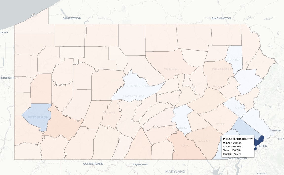 Sharon Machlis, IDG
Rollover info shows Philadelphia's large margin of victory (bottom right)
It might be interesting to map the difference in raw vote margins between one election and another, such as Pennsylvania in 2016 vs. 2020. That map would show where patterns shifted the most and might help explain changes in statewide results.
If you are interested in more election data visualizations, I have made an elections2 R package available on GitHub. You can either install it as-is or check out my R code on GitHub and tailor it for your own use.
For more R tips, head to InfoWorld’s Do More With R page.