


Counting by multiple groups — sometimes called crosstab reports — can be a useful way to look at data ranging from public opinion surveys to medical tests. For example, how did people vote by gender and age group? How many software developers who use both R and Python are men vs. women?
There are a lot of ways to do this kind of counting by categories in R. Here, I’d like to share some of my favorites.
For the demos in this article, I’ll use a subset of the Stack Overflow Developers survey, which surveys developers on dozens of topics ranging from salaries to technologies used. I’ll whittle it down with columns for languages used, gender, and if they code as a hobby. I also added my own LanguageGroup column for whether a developer reported using R, Python, both, or neither.
If you’d like to follow along, the last page of this article has instructions on how to download and wrangle the data to get the same data set I’m using.
The data has one row for each survey response, and the four columns are all characters.
str(mydata)
'data.frame':	83379 obs. of  4 variables:
 $ Gender            : chr  "Man" "Man" "Man" "Man" ...
 $ LanguageWorkedWith: chr  "HTML/CSS;Java;JavaScript;Python" "C++;HTML/CSS;Python" "HTML/CSS" "C;C++;C#;Python;SQL" ...
 $ Hobbyist          : chr  "Yes" "No" "Yes" "No" ...
 $ LanguageGroup     : chr  "Python" "Python" "Neither" "Python" ...
I filtered the raw data to make the crosstabs more manageable, including removing missing values and taking the two largest genders only, Man and Woman.
The janitor package
So, what’s the gender breakdown within each language group? For this type of reporting in a data frame, one of my go-to tools is the janitor package’s tabyl() function.
The basic tabyl() function returns a data frame with counts. The first column name you add to a tabyl() argument becomes the row, and the second one the column.
library(janitor)
tabyl(mydata, Gender, LanguageGroup)

 Gender Both Neither Python   R
    Man 3264   43908  29044 969
  Woman  374    3705   1940 175
What’s nice about tabyl() is it’s very easy to generate percents, too. If you want to see percents for each column instead of raw totals, add adorn_percentages("col"). You can then pipe those results into a formatting function such as adorn_pct_formatting().
tabyl(mydata, Gender, LanguageGroup) %>%
  adorn_percentages("col") %>%
  adorn_pct_formatting(digits = 1)

 Gender  Both Neither Python     R
    Man 89.7%   92.2%  93.7% 84.7%
  Woman 10.3%    7.8%   6.3% 15.3%
To see percents by row, add adorn_percentages("row").
If you want to add a third variable, such as Hobbyist, that’s easy too.
tabyl(mydata, Gender, LanguageGroup, Hobbyist) %>%
  adorn_percentages("col") %>%
  adorn_pct_formatting(digits = 1)
However, it gets a little harder to visually compare results in more than two levels this way. This code returns a list with one data frame for each third-level choice:
$No
 Gender  Both Neither Python     R
    Man 79.6%   86.7%  86.4% 74.6%
  Woman 20.4%   13.3%  13.6% 25.4%

$Yes
 Gender  Both Neither Python     R
    Man 91.6%   93.9%  95.0% 88.0%
  Woman  8.4%    6.1%   5.0% 12.0%
The CGPfunctions package
The CGPfunctions package is worth a look for some quick and easy ways to visualize crosstab data. Install it from CRAN with the usual install.packages("CGPfunctions").
The package has two functions of interest for examining crosstabs: PlotXTabs() and PlotXTabs2(). This code returns bar graphs of the data (first graph below):
library(CGPfunctions)
PlotXTabs(mydata)
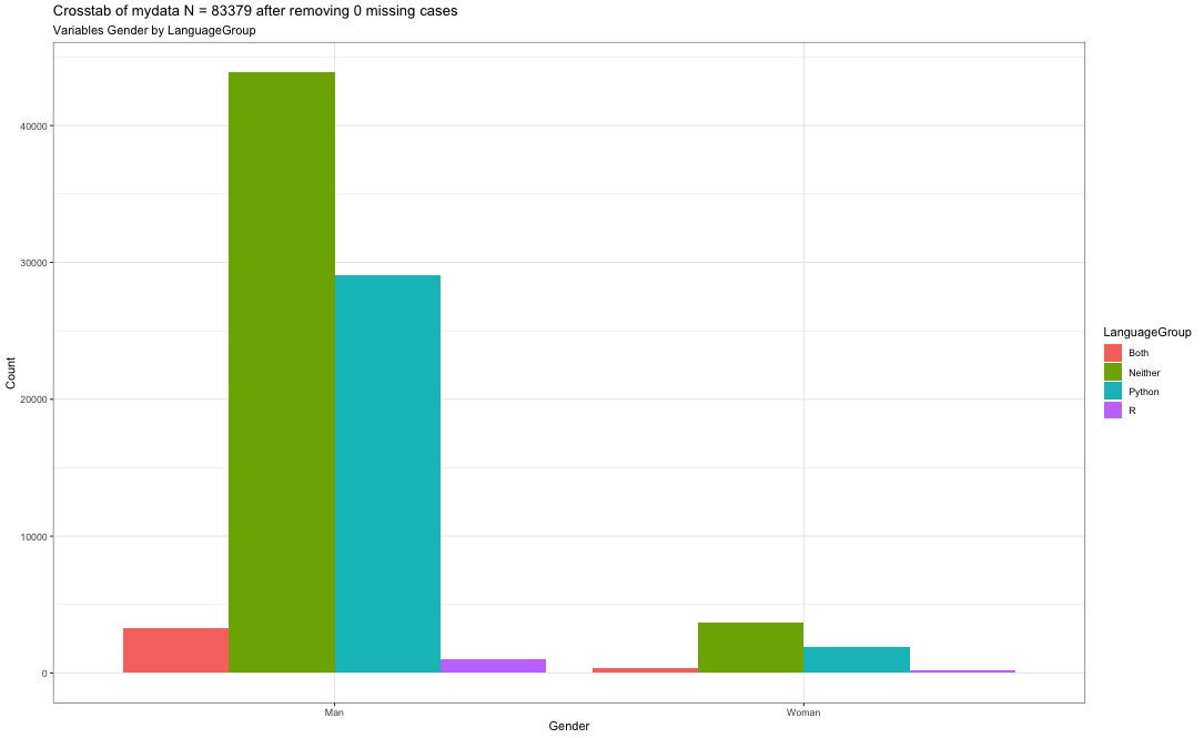 Screen shot by Sharon Machlis, IDG
Result of PlotXTabs(mydata).
PlotXTabs2(mydata) creates a graph with a different look, and some statistical summaries (second graph at left).
If you don’t need or want those summaries, you can remove them with results.subtitle = FALSE, such as PlotXTabs2(mydata, LanguageGroup, Gender, results.subtitle = FALSE).
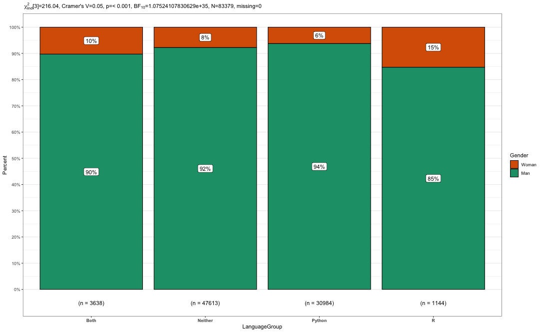 Screen shot by Sharon Machlis, IDG
Result of PlotXTabs(mydata).
PlotXTabs2() has a couple of dozen argument options, including title, caption, legends, color scheme, and one of four plot types: side, stack, mosaic, or percent. There are also options familiar to ggplot2 users, such as ggtheme and palette. You can see more details in the function’s help file.
The vtree package
The vtree package generates graphics for crosstabs as opposed to graphs. Running the main vtree() function on one variable, such as
library(vtree)
vtree(mydata, "LanguageGroup")
gets you this basic response:
 Sharon Machlis, IDG
Basic vtree() function on one variable.
I’m not keen on the color defaults here, but you can swap in an RColorBrewer palette. vtree’s palette argument uses palette numbers, not names; you can see how they’re numbered in the vtree package documentation. I could choose 3 for Greens and 5 for Purples, for example. Unfortunately, those defaults give you a more intense color for lower count numbers, which doesn’t always make sense (and doesn’t work well for me in this example). I can change that default behavior with sortfill = TRUE to use the more intense color for the higher value.
vtree(mydata, "LanguageGroup", palette = 3, sortfill = TRUE)
 Sharon Machlis, IDG
vtree() after changing to a new palette.
If you find the dark color makes it hard to read text, there are some options. One option is to use the plain argument, such as vtree(mydata, "LanguageGroup", plain = TRUE). Another option is to set a single fill color instead of a palette, using the fillcolor argument, such as vtree(mydata, LanguageGroup", fillcolor = "#99d8c9").
To look at two variables in a crosstab report, simply add a second column name and palette or color if you don’t want the default. You can use the plain option or specify two palettes or two colors. Below I chose specific colors instead of palettes, and I also rotated the graph to read vertically.
vtree(mydata, c("LanguageGroup", "Gender"),
   fillcolor = c( LanguageGroup = "#e7d4e8", Gender = "#99d8c9"),
   horiz = FALSE)
Sharon Machlis, IDG
vtree() for two variables.
You can add more than two categories, although it gets a bit harder to read and follow as the tree grows. If you’re only interested in some of the branches, you can specify which to display with the keep argument. Below, I set vtree() to show only people who use R without Python or who use both R and Python.
vtree(mydata, c("Gender", "LanguageGroup", "Hobbyist"),
  horiz = FALSE, fillcolor = c(LanguageGroup = "#e7d4e8",
  Gender = "#99d8c9", Hobbyist = "#9ecae1"),
  keep = list(LanguageGroup = c("R", "Both")), showcount = FALSE)
With the tree getting so busy, I think it helps to have either the count or the percent as node labels, not both. So that last argument in the code above, showcount = FALSE, sets the graph to display only percents and not counts.
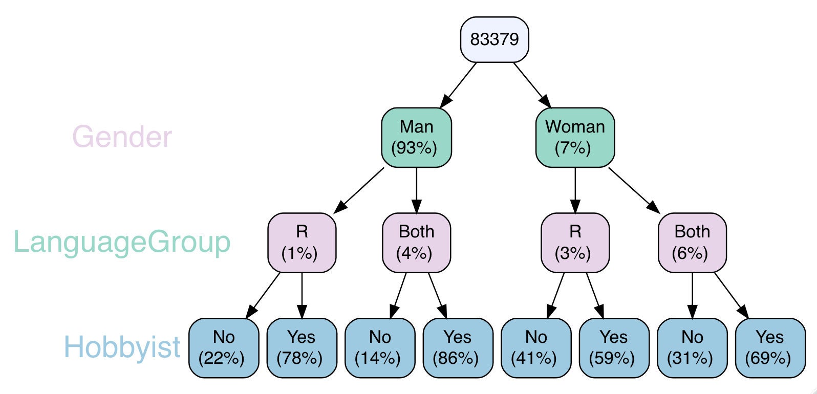 Sharon Machlis, IDG
Three-level vtree graphic with a subset of nodes, displaying percents only.
More count by group options
There are other useful ways to group and count in R, including base R, dplyr, and data.table. Base R has the xtabs() function specifically for this task. Note the formula syntax below: a tilde and then one variable plus another variable.
xtabs(~ LanguageGroup + Gender, data = mydata)
             Gender
LanguageGroup   Man Woman
      Both     3264   374
      Neither 43908  3705
      Python  29044  1940
      R         969   175
dplyr’s count() function combines “group by” and “count rows in each group” into a single function.
library(dplyr)
my_summary <- mydata %>%
  count(LanguageGroup, Gender, Hobbyist, sort = TRUE)

my_summary
   LanguageGroup Gender Hobbyist     n
1        Neither    Man      Yes 34419
2         Python    Man      Yes 25093
3        Neither    Man       No  9489
4         Python    Man       No  3951
5           Both    Man      Yes  2807
6        Neither  Woman      Yes  2250
7        Neither  Woman       No  1455
8         Python  Woman      Yes  1317
9              R    Man      Yes   757
10        Python  Woman       No   623
11          Both    Man       No   457
12          Both  Woman      Yes   257
13             R    Man       No   212
14          Both  Woman       No   117
15             R  Woman      Yes   103
16             R  Woman       No    72
In the three lines of code below, I load the data.table package, create a data.table from my data, and then use the special .N data.table symbol that stands for number of rows in a group.
library(data.table)
mydt <- setDT(mydata)
mydt[, .N, by = .(LanguageGroup, Gender, Hobbyist)]
Visualizing with ggplot2
As with most data, ggplot2 is a good choice to visualize summarized results. The first ggplot graph below plots LanguageGroup on the X axis and the count for each on the Y axis. Fill color represents whether someone says they code as a hobby. And, facet_wrap says: Make a separate graph for each value in the Gender column.
library(ggplot2)
ggplot(my_summary, aes(LanguageGroup, n, fill = Hobbyist)) +
  geom_bar(stat = "identity") +
  facet_wrap(facets = vars(Gender))
 Sharon Machlis, IDG
Using ggplot2 to compare language use by gender.
Because there are relatively few women in the sample, it’s difficult to compare percentages across genders when both graphs use the same Y-axis scale. I can change that, though, so each graph uses a separate scale, by adding the argument scales = “free_y” to the facet_wrap() function:
ggplot(my_summary, aes(LanguageGroup, n, fill = Hobbyist)) +
  geom_bar(stat = "identity") +
  facet_wrap(facets = vars(Gender), scales = "free_y")
Now it’s easier to compare multiple variables by gender.
For more R tips, head to the “Do More With R” page on InfoWorld or check out the “Do More With R” YouTube playlist.
See the next page for info on how to download and wrangle data used in this demo.