


Racing bar charts can be a useful way to visualize comparative data over time. There are a number of ways to create them in R, including combining ggplot with gganimate or using echarts4r. But the easiest way I’ve found so far is with the ddplot package.
Welcome to ddplot
ddplot isn’t on CRAN, so you’ll need to install it from GitHub with a package like devtools or remotes.
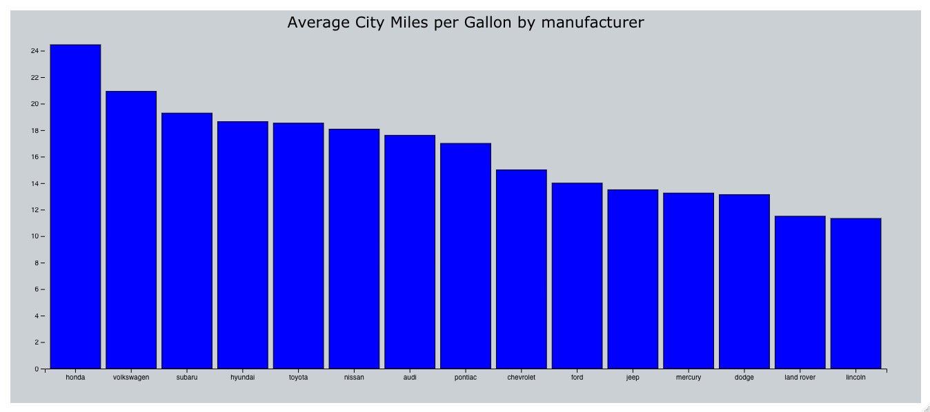
remotes::install_github("feddelegrand7/ddplot", build_vignettes = TRUE)ddplot is an R wrapper for the D3 JavaScript library, and it does more than racing bars. For example, here is code adapted from the package website for a static bar chart using the mpg data set from ggplot2.
library(dplyr)
library(ggplot2) #loaded for the mpg data set only
library(ddplot)
mpg %>% group_by(manufacturer) %>%
  summarise(mean_cty = mean(cty)) %>%
  barChart(
    x = "manufacturer",
    y = "mean_cty",
    fill = "blue",
    stroke = "black",
    title = "Average City Miles per Gallon by manufacturer",
    sort = "descending"
  )
 Sharon Machlis, IDG
Static bar chart created with ddplot.
There we have a perfectly nice chart. But animating the bars makes things interesting!
Racing bar chart demo in R
For data in this demo, I’ll download raw daily vaccination info by US state from the Our World in Data GitHub repository.
all_data <- read.csv("https://github.com/owid/covid-19-data/raw/master/public/data/vaccinations/us_state_vaccinations.csv")This data frame has 14 columns and more than 15,000 rows – too many for an animated bar chart. So next, I’ll filter the data for once a week (every Wednesday) instead of daily, starting in March, for six states. (That should be more manageable than trying to watch 50 states’ animated bars.)
graph_data <- all_data %>%
  mutate(
    Date = as.Date(date),
    day_of_week = weekdays(Date),
    PctFullyVaxed = round(people_fully_vaccinated_per_hundred, 1)
  ) %>%
  filter(day_of_week == "Wednesday", date >= "2021-03-01",
        location %in% c("Vermont", "Alaska", "New York",
          "California", "Massachusetts", "West Virginia")) %>%
  rename(State = location) %>%
  select(Date, State, PctFullyVaxed)
If you’re following along, feel free to select your own six states.
ddplot has a barChartRace() function that’s extremely easy to use. The key barChartRace() arguments include data frame, x column, y column, time column, color category if you want to change the default (as far as I know, you can only choose from 10 available D3 categorical palettes), and how to sort the charts. The syntax:
barChartRace(
  data, # data frame
  x, # name of x axis column as string
  y, # name of y axis column as string
  time, #name of time variable column as strong
  colorCategory, # 1 of 10 available D3 named categorical color palettes
  sort # 'none', 'ascending', 'descending'
)
There are more ways to customize your racing bars, including frame and transition speed, font size, titles, panel and background colors, and axis ticks:
barChartRace(
  # in addition to key arguments above
  frameDur, # length each frame should show in milliseconds
  transitionDur, # length of frame transition in milliseconds
  xFontSize and yFontSize,
  xtitle and ytitle,
  title, # plot title
  titleFontSize,
  panelcol, #graph panel background color
  bgcol, #background color of the frame around the graph
  font, # font family
  timeLabelOpts # options include size, prefix and suffix
  )
Here is how easy it is to generate a default racing bar chart:
graph_data %>%
  barChartRace(
    x = "PctFullyVaxed",
    y = "State",
    time = "Date",
    title = "Percent Fully Vaccinated by State"
  )
Only x, y, and time columns are required; I also added a title.
 Sharon Machlis, IDG
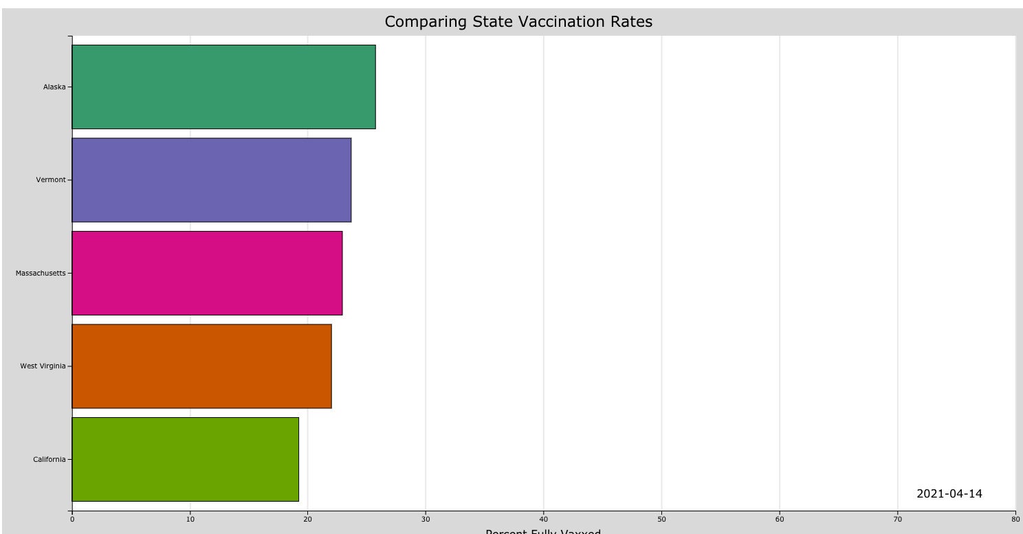
Below is code for a more customized version with an axis title, a different label font size and color palette, and a longer time each frame displays.
graph_data %>%
  barChartRace(
    x = "PctFullyVaxed",
    y = "State",
    time = "Date",
    xtitle = "Percent Fully Vaxxed",
    title = "Comparing State Vaccination Rates",
    frameDur = 750,
    colorCategory = "Dark2",
    panelcol = "white",
    bgcol = "#DCDCDC",  # a light gray
    xgridlinecol = "#EBEBEBFF",
    timeLabelOpts = list(size = 16)
  )
 Sharon Machlis, IDG
Screenshot of a ddplot racing bar chart with customized colors. Watch the video above to see the racing bars in action.
Check out the barChartRace() help file with
?barChartRace
if you want to see additional ways to customize a racing bar chart.
For more R tips, head to the InfoWorld Do More With R page.