


Static visualizations are often enough to tell stories with your data. But sometimes you want to add interactivity, so users can hover over graphs to see underlying data or link their hover over one visualization to highlighting data in another.
R has a number of packages for creating interactive graphics including echarts4r, plotly, and highcharter. I like and use all of those. But for easy linking of interactive graphs, it’s hard to beat ggiraph.
From ggplot to ggiraph in 3 easy steps
There are three easy steps to turn ggplot code into an interactive graph:
- Use a ggiraph interactive geom instead of a “regular” ggplot geom. The format is easy to remember: Just add _interactive to your usual geom. So,
geom_col()for a regular bar chart would begeom_col_interactive(),geom_point()would begeom_point_interactive(), and so on. - Add at least one interactive argument to the graph’s
aes()mapping:tooltip,data_id, oronclick. Thatdata_idargument is what connects two graphics, letting you hover over one and affect the display of another one — all without Shiny. - After creating your ggiraph dataviz object, use the
girafe()function to turn it into a JavaScript graphic. Yes, that’sgirafe()like the animal but with one f. (That’s how you spell it in French, and the creator of ggiraph, David Gohel, lives in Paris.)
Install the R packages
If you’d like to follow along with the code in this tutorial, you’ll need the ggplot2, ggiraph, dplyr, and patchwork packages from CRAN on your system as well as ggiraph. And, to create a map, I’ll be using Bob Rudis’s albersusa package, which isn’t on CRAN. You can install it from GitHub with
remotes::install_github("hrbrmstr/albersusa")or
devtools::install_github("hrbrmstr/albersusa")Prepare the data
For data, I’m going to use recent US Covid vaccination data by state available from the Our World in Data GitHub repository.
In the code below, I’m loading libraries, reading in the vaccination data, and changing “New York State” to just “New York” in the data frame.
library(dplyr)
library(ggplot2)
library(ggiraph)
library(patchwork)

data_url <- "https://github.com/owid/covid-19-data/raw/master/public/data/vaccinations/us_state_vaccinations.csv"

all_data <- read.csv(data_url)
all_data$location[all_data$location == "New York State"] <- "New York"
Next, I create a vector of entries that aren’t US states or DC. I’ll use it to filter out that data so my chart doesn’t have too many rows.
not_states_or_dc <- c("American Samoa", "Bureau of Prisons",
  "Dept of Defense", "Federated States of Micronesia", "Guam",
  "Indian Health Svc", "Long Term Care", "Marshall Islands",
  "Northern Mariana Islands", "Puerto Rico", "Republic of Palau",
  "United States", "Veterans Health", "Virgin Islands")
This next code block filters out the non_states_or_dc rows, chooses only the most recent data, rounds the percent vaccinated to one decimal point, selects only the state and percent vaccinated columns, and renames my selected columns to State and PctFullyVaccinated.
bar_graph_data_recent <- all_data %>%
  filter(date == max(date), !(location %in% not_states_or_dc)) %>%
  mutate(
   PctFullyVaccinated = round(people_fully_vaccinated_per_hundred, 1)
  ) %>%
  select(State = location, PctFullyVaccinated)
Create a basic bar graph with ggplot2
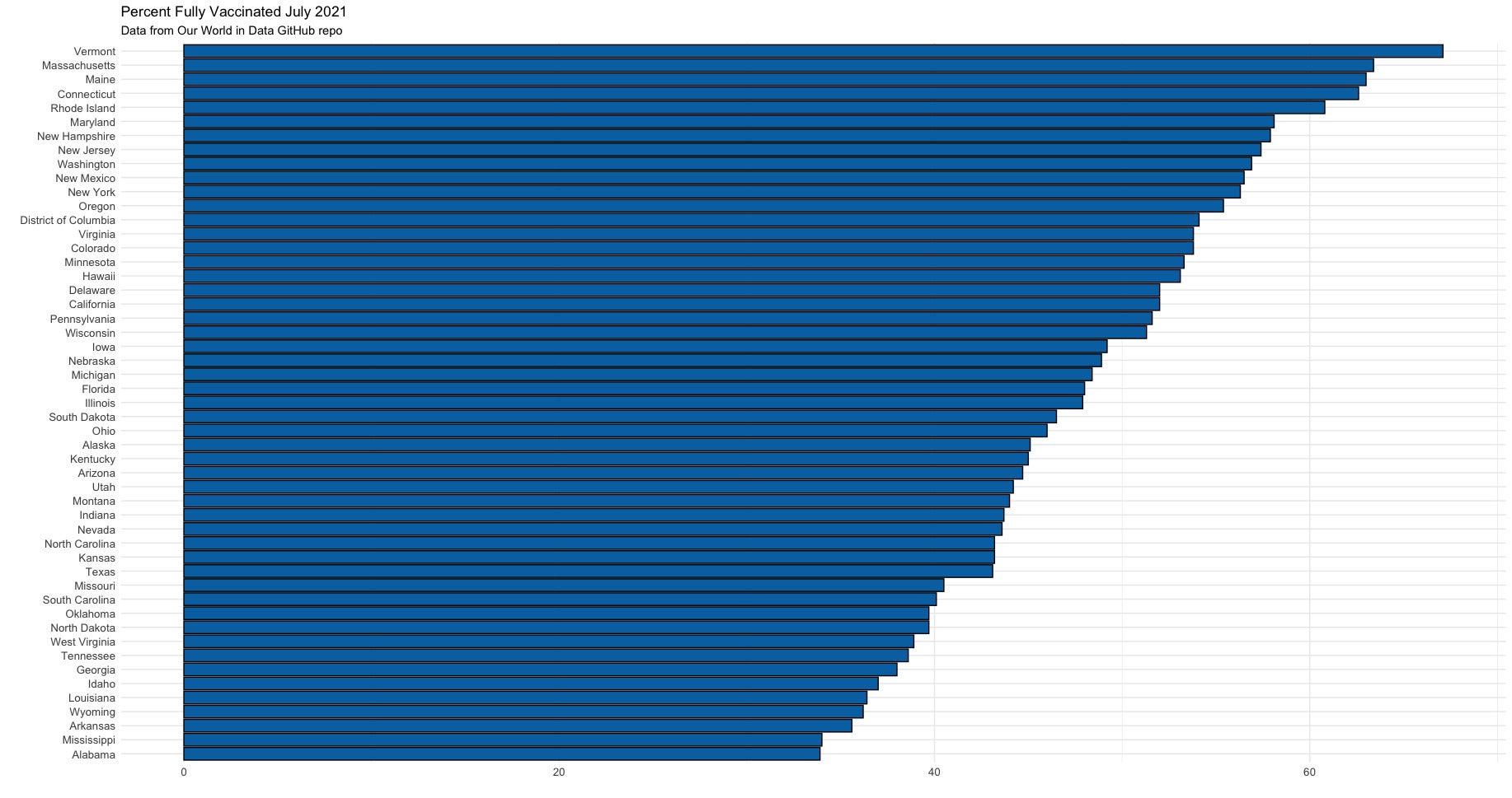
Next I’ll create a basic (static) ggplot bar chart of the data. I use geom_col() for a bar chart, add my own customary blue bars outlined in black and minimal theme, set the axis text size to 10 points, and flip the x and y coordinates so it’s easier to read the state names.
bar_graph <- ggplot(bar_graph_data_recent,
                aes(x = reorder(State, PctFullyVaccinated),
                    y = PctFullyVaccinated)) +
  geom_col(color = "black", fill="#0072B2", size = 0.5) +
  theme_minimal() +
  theme(axis.text=element_text(size = 10)) +
  labs(title = "Percent Fully Vaccinated July 2021",
       subtitle = "Data from Our World in Data GitHub repo"
       ) +
   ylab("") +
   xlab("") +
  coord_flip()

bar_graph
 Sharon Machlis, IDG
Bar chart of US vaccination data by state created with ggplot2. Data from Our World in Data.
Create a tooltip column in R
ggiraph only lets me use one column for the tooltip display, but I want both state and rate in my tooltip. There’s an easy solution: Add a tooltip column to the data frame with both state and rate in one text string:
bar_graph_data_recent <- bar_graph_data_recent %>%
  mutate(
    tooltip_text = paste0(toupper(State), "\n",
                   PctFullyVaccinated, "%")
  )
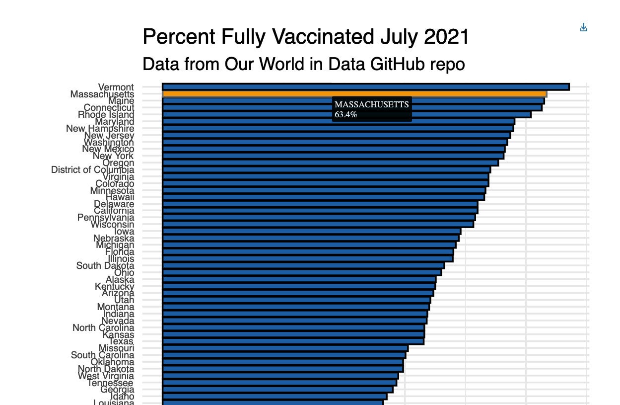
Make the bar chart interactive with ggiraph
To create a ggiraph interactive bar chart, I changed geom_col() to geom_col_interactive() and added tooltip and data_id to the aes() mapping. I also reduced the size of the axis text, because the ggplot size ended up being too large.
Then I displayed the interactive graph object with the girafe() function. You can set the graph width and height with width_svg and height_svg arguments within girafe().
latest_vax_graph <- ggplot(bar_graph_data_recent,
                aes(x = reorder(State, PctFullyVaccinated),
                    y = PctFullyVaccinated,
                    tooltip = tooltip_text, data_id = State #<<
                    )) +
  geom_col_interactive(color = "black", fill="#0072B2", size = 0.5) +  #<<
  theme_minimal() +
  theme(axis.text=element_text(size = 6)) +  #<<
  labs(title = "Percent Fully Vaccinated July 2021",
       subtitle = "Data from Our World in Data GitHub repo"
       ) +
   ylab("") +
   xlab("") +
  coord_flip()

girafe(ggobj = latest_vax_graph, width_svg = 5, height_svg = 4)
The graph will look quite similar to the ggplot version — but if you run the code yourself or watch the video embedded above, you’ll see that you can now hover over the bars and see underlying data.
 Sharon Machlis, IDG
If you hover over a bar on a ggiraph graph, the bar is highlighted and you can see a tooltip with underlying data. Data from Our World in Data.
One thing that really makes ggiraph shine is how easy it is to link up multiple graphs. To demo that, of course, I’ll need a second visualization to link to my bar chart.
The code below creates a data frame with vaccination data from February 14, 2021, and a ggiraph bar chart with that data.
bar_graph_data_early <- all_data %>%
  filter(date == "2021-02-14", !(location %in% not_states_or_dc)) %>%
  arrange(people_fully_vaccinated_per_hundred) %>%
  mutate(
    PctFullyVaccinated = round(people_fully_vaccinated_per_hundred, 1),
    tooltip_text = paste0(toupper(location), "\n", PctFullyVaccinated, "%")
  ) %>%
  select(State = location, PctFullyVaccinated, tooltip_text)

early_vax_graph <- ggplot(bar_graph_data_early, aes(x = reorder(State, PctFullyVaccinated), y = PctFullyVaccinated, tooltip = tooltip_text, data_id = State)) +
  geom_col_interactive(color = "black", fill="#0072B2", size = 0.5) +
  theme_minimal() +
  theme(axis.text=element_text(size = 6)) +
  labs(title = "Fully Vaccinated as of February 14, 2021",
       subtitle = "Data from Our World in Data"
  ) +
  ylab("") +
  xlab("") +
  coord_flip()
Link interactive graphs with ggiraph
The code to link the two graphs is extremely simple. Below I use the girafe() function to say I want to print the early_vax_graph plus the latest_vax_graph and set the canvas width and height. I also add an option so when the user hovers, the bars turn cyan.
girafe(code = print(early_vax_graph + latest_vax_graph),
       width_svg = 8, height_svg = 4) %>%
  girafe_options(opts_hover(css = "fill:cyan;"))
Linking the two graphs makes it easy for users to see what happened to state rankings between February and July. For example, by hovering over Alaska in the February graph, the bar for Alaska in the July graph also turns cyan. (Without that option, the bars would turn the default yellow color.)
 Sharon Machlis, IDG
Hovering over a state’s bar in one graph highlights that state’s bars on both graphs. Data from Our World in Data.
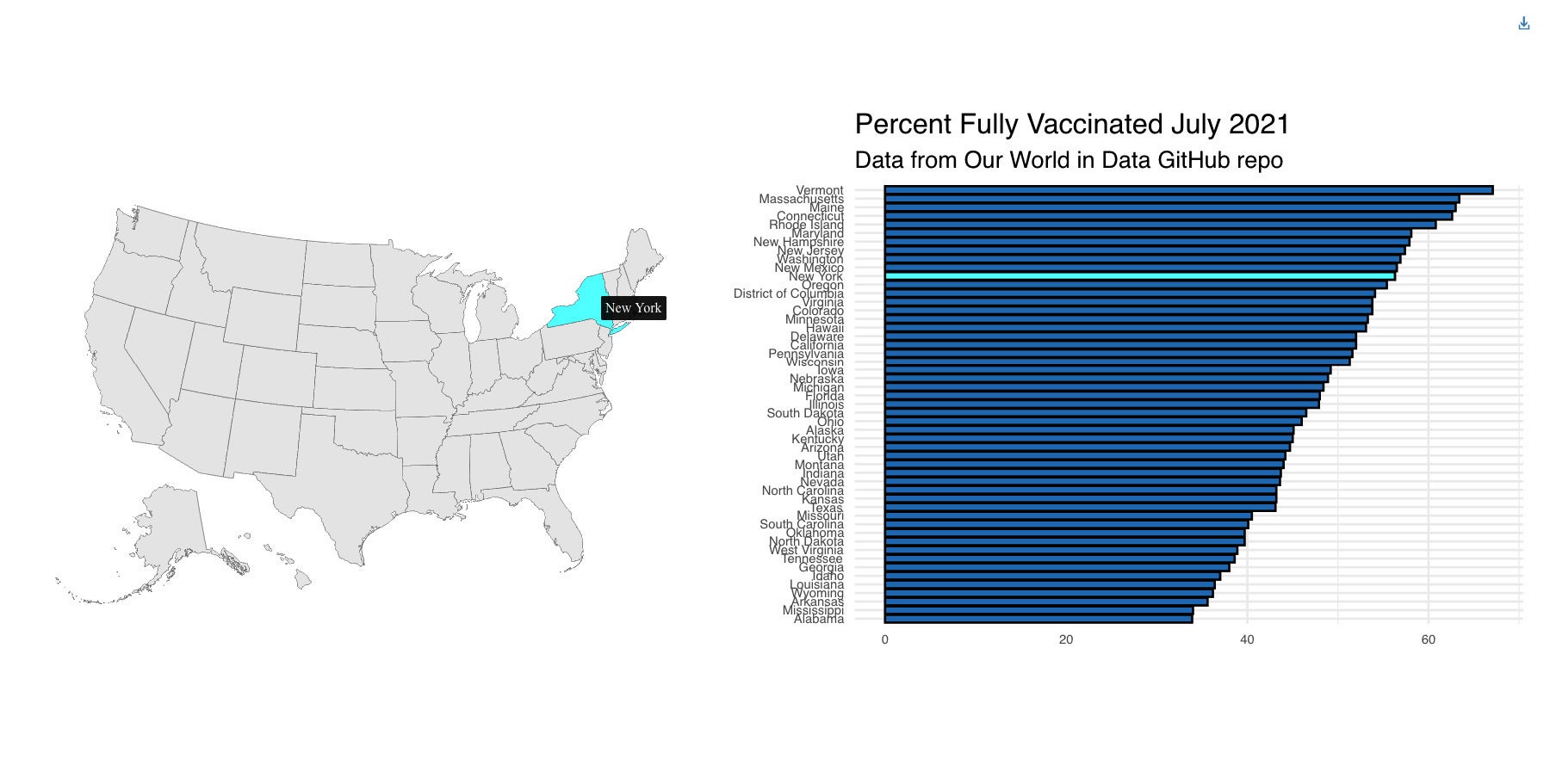
Link a map and bar chart with ggiraph
This idea comes from Kyle E. Walker, who coded a demo using his tidycensus package to create a map linked with a chart. We can do the same with this data and a map from scratch using the albersusa package (although I highly recommend tidycensus if you’re working with U.S. Census data).
Below is the code for the map. us_sf is an R simple features geospatial object created with the albersusa::usa_sf() function. state_map creates a ggiraph map object from that us_sf object. The map code uses typical ggplot() syntax, but instead of geom_sf() it uses geom_sf_interactive(). There are also tooltip and data_id arguments in the aes() mapping. Finally, the code eliminates any background or axes with theme_void().
library(albersusa)
us_sf <- usa_sf("lcc") %>%
  mutate(State = as.character(name))

state_map <- ggplot() +
  geom_sf_interactive(data = us_sf, size = 0.125,
                      aes(data_id = State, tooltip = State)) +
  theme_void()
The next code block uses girafe() and its ggobj argument to display both the map and the vax graph, linked interactively.
girafe(ggobj = state_map + latest_vax_graph,
       width_svg = 10, height_svg = 5) %>%
  girafe_options(opts_hover(css = "fill:cyan;"))
Now if I hover over a state on the map, its bar “lights up” on the bar chart.
 Sharon Machlis, IDG
Hover over a state on the map, and its corresponding bar “lights up” on the bar chart. Data from Our World in Data.
It takes very little R code to make a static graphic interactive and to link two graphs together.
How to use your ggiraph data visualizations
You can add ggiraph visualizations to an R Markdown document and generate an HTML file that works in any web browser.
You can also save output from the girafe() function as an HTML widget and then save the widget to an HTML file using the htmlwidgets package. For example:
my_widget <- girafe(ggobj = state_map + latest_vax_graph,
                    width_svg = 10, height_svg = 5) %>%
  girafe_options(opts_hover(css = "fill:cyan;"))

htmlwidgets::saveWidget(my_widget, "my_widget_page.html",
                        selfcontained = TRUE)
For more on ggiraph, check out the ggiraph package website.
And for more R tips, head to the InfoWorld Do More With R page.