


The ggplot2 data visualization R package is extremely powerful and flexible. However, it’s not always easy to remember how to do every task – especially if you’re not a frequent user. How do you change the size of a graph title? How do you remove legend titles? My usual solution is to save RStudio code snippets for things I have trouble remembering. But there’s also a package that can help: ggeasy.
As the name says, the goal of ggeasy is to, well, make ggplot2 easy – or at least easier. It has what some people may find to be more intuitive functions for typical tasks, mostly around text and axis formatting. (This package doesn’t affect the way lines, points, and bars look and behave). All ggeasy functions start with easy_ so it’s, yes, easy to find them using RStudio autocomplete. You can see how that works in the video above.
If you’d like to follow along with my example below, ggeasy is on CRAN, so you can install it with install.packages("ggeasy"). I will also be using the ggplot2 (naturally), dplyr, rio, and lubridate packages. Later, I will add the patchwork package for super simple placement of multiple graphs; that’s also on CRAN.
For this example, I’m going to use data about what’s on most people’s minds these days: coronavirus. You can download a CSV file with data by U.S. state from the Coronavirus Tracking Project with
download.file("http://covidtracking.com/api/states/daily.csv",
              destfile = "covid19.csv")
(You can name the destfile destination file anything you’d like.) I used rio::import() to import the data, but you can also use readr::read_csv(), read.csv(), data.table::fread(), or any other function to import the CSV.
With rio, the dates came in as integers, so I’ll use lubridate’s ymd() function to turn that column into Date objects:
data$date <- lubridate::ymd(data$date)
To create a graph that is not too difficult to understand, I’ll filter this data for just a couple of states so there aren’t 50 separate time-series lines. I chose Louisiana to see the rise in cases there – the Louisiana governor said the state has among the world’s fastest growth in cases. (There is speculation that Mardi Gras in February might have caused a cluster in New Orleans.) I will also add Massachusetts, a state with about 50 percent more people than Louisiana, since I’m based there.
After filtering the data, I’ll create a basic line graph of the data:
states2 <- filter(data, state %in% c("LA", "MA"))
ggplot(states2, aes(x = date, y = positive, color = state)) +
geom_line() +
geom_point() +
theme_minimal() +
ggtitle("Lousiana & Massachusetts Daily Covid-19 Cases")
Sharon Machlis, IDG
Basic graph of Louisiana and Massachusetts daily total COVID-19 cases made with ggplot1.
That’s a pretty steep increase. Some of that may be due to an increase in testing – maybe we just know about more cases because testing ramped up. I’ll look at that in a minute.
First, though, how about a few tweaks to this graph?
Let’s start by making the graph title larger. To use ggeasy, I’d start typing easy_ in the RStudio top left source pane and scroll until I find what I want.
 Sharon Machlis, IDG
Typing easy_ in RStudio helps find ggeasy functions.
easy_plot_title_size() looks like the function I need. I can change the graph title to 16-point type with this code:
ggplot(states2, aes(x = date, y = positive, color = state)) +
  geom_line() +
  geom_point() +
  theme_minimal() +
  ggtitle("Lousiana & Massachusetts Daily Covid-19 Cases") +
  easy_plot_title_size(16)
I can rotate x-axis text with easy_rotate_x_labels(90) for a 90-degree rotation, and remove the legend title (it’s pretty obvious these are states) with easy_remove_legend_title(). The full graph code is below, including storing the graph in a variable called positives.
positives <- ggplot(states2, aes(x = date, y = positive, color = state)) +
  geom_line() +
  geom_point() +
  theme_minimal() +
  ggtitle("Lousiana & Massachusetts Daily Covid-19 Cases") +
  easy_plot_title_size(16) +
  easy_rotate_x_labels(90) +
  easy_remove_legend_title()
 Sharon Machlis, IDG
Graph with several ggeasy function tweaks including rotating x-axis text and increasing title size.
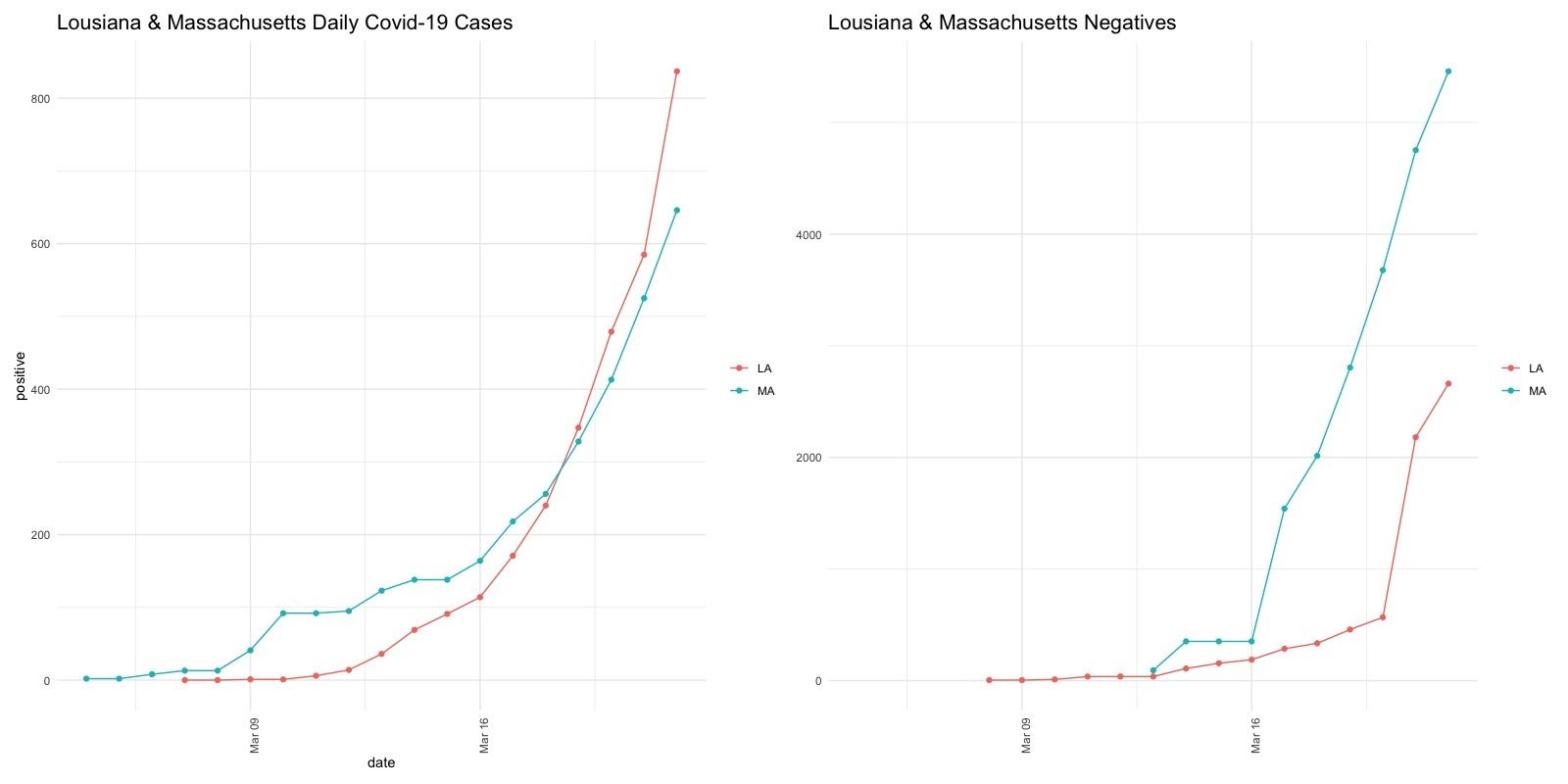
Next, I’d like to look at the negative coronavirus test results, to see if they’re rising at similar rates to positives. I’ll use the same code but just switch the y column to negatives.
negatives <- ggplot(states2, aes(x = date, y = negative, color = state)) +
  geom_line() +
  geom_point() +
  theme_minimal() +
  ggtitle("Lousiana & Massachusetts Negatives") +
  easy_plot_title_size(16) +
  easy_rotate_x_labels(90) +
  easy_remove_x_axis("title") +
  easy_remove_y_axis("title") +
  easy_remove_legend_title()
 Sharon Machlis, IDG
Graph of negative COVID-19 test results.
There seems to be a larger rise in positives than negatives in Louisiana. Although we don’t know if that’s because testing criteria changed or something else.
It would be helpful to see these two graphs side by side. That’s where the patchwork package comes in.
With just these two lines of code, the first loading the patchwork package:
library("patchwork")
positives + negatives
I get this:
 Sharon Machlis, IDG
Side-by-side ggplot2 graphs with the patchwork package.
It’s incredibly easy to place multiple graphs with patchwork. For more on how to customize layouts, head to the patchwork website.
I can now go back and use ggeasy to remove one of the legends so there aren’t two, and then re-run patchwork:
negatives <- negatives +
  easy_remove_legend()
positives + negatives
Clearly, ggeasy is quite useful for some quick – and easy – data exploration!
For more R tips, head to the “Do More With R” page on InfoWorld or check out the “Do More With R” YouTube playlist.