


ggplot2 is an enormously popular R package, and for good reason: It’s powerful, flexible, and well-thought-out. But it has a difficult learning curve, and there are people who find some of its functions hard to remember at times. If you want to create a bar chart or line graph that is report-ready right out of the box—quickly, easily, and with fairly intuitive code—ggcharts may be for you.
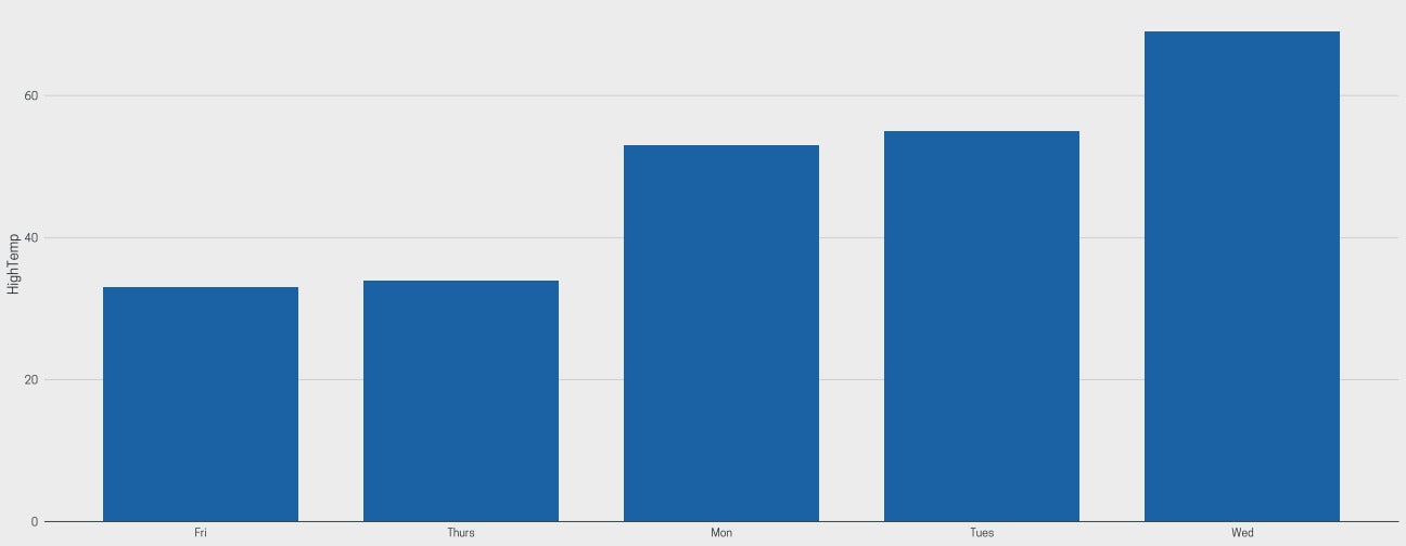
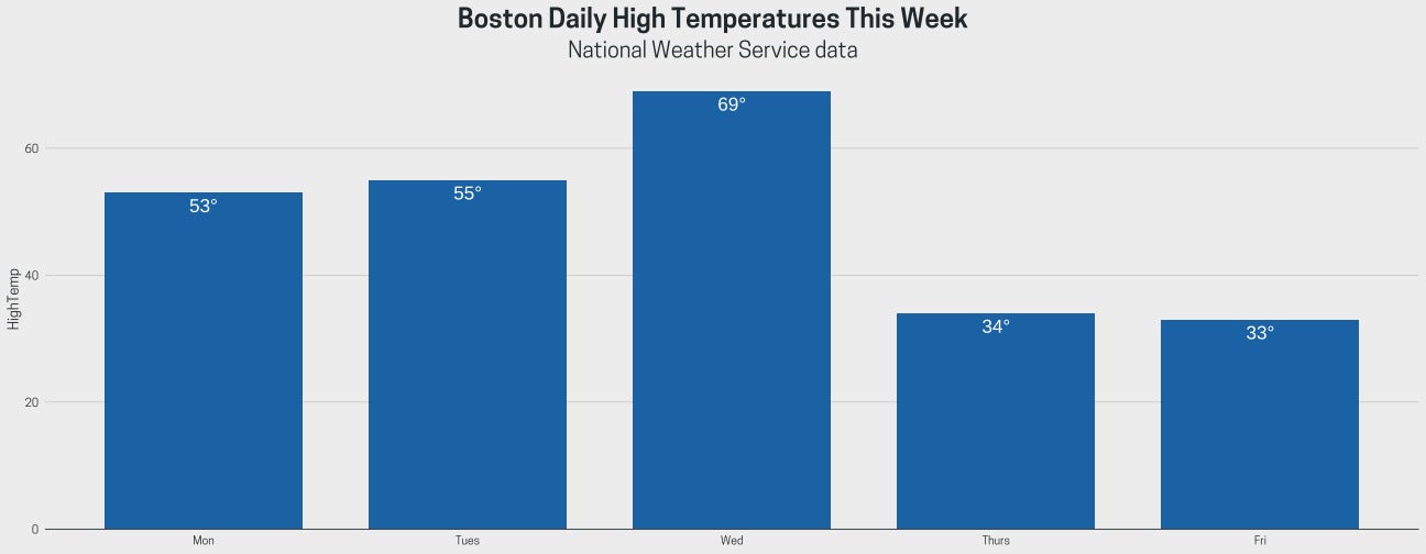
Here’s a quick example. Below is a bar chart of high temperatures in Boston during a recent work week.
 Sharon Machlis
Graph generated by ggplot2 in R.
That comes from this data, if you want to follow along:
Day <- factor(c("Mon", "Tues", "Wed", "Thurs", "Fri"),
              levels = c("Mon", "Tues", "Wed", "Thurs", "Fri"), ordered = TRUE)
HighTemp <- c(53, 55, 69, 34, 33)
bos_high_temps <- data.frame(Day, HighTemp)
This is my ggplot2 code that made the graph:
library(ggplot2)
ggplot(bos_high_temps, aes(x=Day, y=HighTemp)) +
  geom_col(color = "black", fill="#0072B2") +
  theme_minimal() +
  theme(panel.border = element_blank(), panel.grid.major = element_blank(),
        panel.grid.minor = element_blank(), axis.line =
          element_line(colour = "gray"),
        plot.title = element_text(hjust = 0.5, size = 24),
        plot.subtitle = element_text(hjust = 0.5, size = 20),
        axis.text = element_text(size = 16)
  )
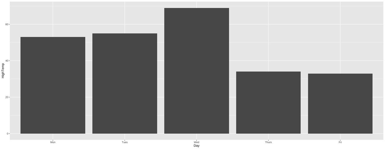
Now here’s a ggcharts graph with the same data:
 Sharon Machlis
Graph generated by ggcharts in R.
and the ggcharts code for that graph:
library(ggcharts)
column_chart(bos_high_temps, x = Day, y = HighTemp)
That’s less code to get a similar result.
To be fair, I didn’t need all of the customization I added to the ggplot version. But I often don’t like the ggplot defaults. For example:
ggplot(bos_high_temps, aes(x = Day, y = HighTemp)) + geom_col()
 Sharon Machlis
Bar chart in ggplot using defaults.
There are ways around having to write a lot of code to customize ggplot. You can set up new ggplot2 defaults, create your own theme, or use RStudio code snippets. But these require you to already know how to do the customization. I do recommend learning these skills if you regularly visualize data with tidyverse packages—ggplot knowledge is very useful! But for someone just starting out, or people who don’t generate plots very often, this may not be a high priority.
What is ggcharts?
ggcharts is a wrapper package for ggplot2. It does a very small subset of what ggplot is capable of. However, the R objects you create with ggcharts are also ggplot objects. And that means you can add ggplot customization code if you want to tweak your results later on. That can give you the best of both worlds—as long as you’re making one of the half dozen or so types of visualizations included in the package. ggcharts currently has functions to make bar charts (horizontal, vertical, or diverging), lollipop (including diverging) charts, line graphs, dumbells, and pyramids. ggcharts is not an option for visualizations like scatterplots or box plots, at least not yet.
I find some basic tweaks a bit easier and more intuitive in ggcharts than in ggplot2 (although they’re much more limited). For example, the ggcharts bar graph default assumes you want to sort the results by y value (as opposed to keeping the x-axis in a specific order). A lot of times that is exactly what you want.
(To do that with ggplot2, you usually need to reorder your x values by your y value, such as aes(x=reorder(myxcolname, -myycolname), y=myycolname)).)
With ggcharts, if you don’t want to sort by y value, just use the argument sort = FALSE:
column_chart(bos_high_temps, x = Day, y = HighTemp,
          sort = FALSE)
It’s easy to look up the options for functions like column_chart() by running a typical R help command such as ?column_chart.
column_chart(
  data,
  x,
  y,
  facet = NULL,
  ...,
  bar_color = "auto",
  highlight = NULL,
  sort = NULL,
  horizontal = FALSE,
  top_n = NULL,
  threshold = NULL,
  limit = NULL
)
ggcharts arguments
data: Dataset to use for the bar chart.x: Character or factor column of data.y: Numeric column of data representing the bar length. If missing, the bar length will be proportional to the count of each value inx.facet: Character or factor column of data defining the faceting groups...: Additional arguments passed toaes().bar_color: Character. The color of the bars.highlight: Character. One or more value(s) ofxthat should be highlighted in the plot.sort: Logical. Should the data be sorted before plotting?- horizontal: Logical. Should the plot be oriented horizontally?
top_n: Numeric. If a value fortop_nis provided only the toptop_nrecords will be displayed.threshold: Numeric. If a value for threshold is provided only records withy> threshold will be displayed.other: Logical. Should allxwithy< threshold be summarized in a group called “other” and be displayed at the bottom of the chart?limit: Deprecated. Usetop_ninstead.
Those three dots in the arguments mean you can add in any ggplot aes() argument, not just the ones defined by ggcharts.
Highlight data points with ggcharts
The ggcharts highlight argument lets you choose one or more x values to highlight visually on your graph.
To highlight the highest temperature in any bar graph of daily temperatures—that is, “whatever the x value is for my highest y value” instead of a hard-coded x value, I’d calculate that x value, save it to a variable (in this case maxday), and then use that variable name with the highlight argument. dplyr’s slice_max() and pull() functions are very handy for finding which day had the highest value:
library(dplyr)
maxday <- bos_high_temps %>%
  slice_max(HighTemp) %>%
  pull(Day)
column_chart(bos_high_temps, x = Day, y = HighTemp, sort = FALSE,
          highlight = maxday
)
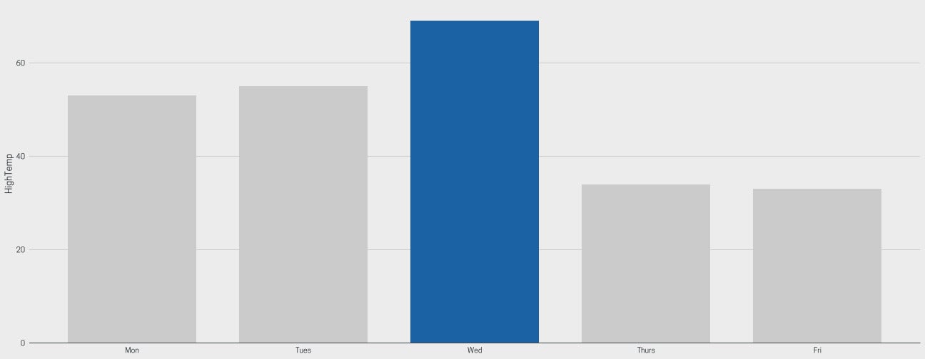 Sharon Machlis
Graph with highest value highlighted, created with the ggcharts R package.
If you want to change the highlight color, you can use the highlight_spec() function to define what values get highlighted, the highlight color, and the non-highlight color, such as:
spec <- highlight_spec(
  what = maxday,
  highlight_color = "darkred",
  other_color = "lightgray"
)
column_chart(bos_high_temps, x = Day, y = HighTemp, sort = FALSE,
          highlight = spec
)
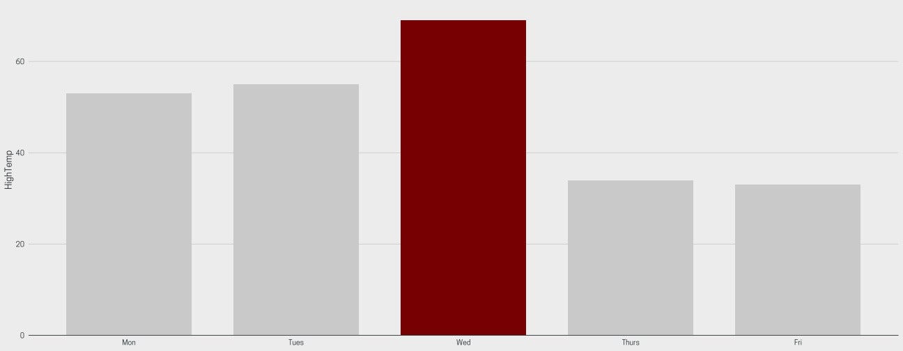 Sharon Machlis
Customizing the highlight color in ggcharts.
If you know ggplot, you can add more customization to your ggcharts graph. The example below adds a title and subtitle, sets the plot title and subtitle font size, and centers them. I also used ggplot’s geom_text() function to add labels to the bars.
column_chart(bos_high_temps, x = Day, y = HighTemp, sort = FALSE) +
  ggtitle("Boston Daily High Temperatures This Week",
  subtitle = "National Weather Service data") +
  theme(
    plot.title = element_text(hjust = 0.5, size = 24),
    plot.subtitle = element_text(hjust = 0.5, size = 20)
  ) +
  geom_text(aes(label = paste0(HighTemp, '\u00B0')), vjust=1.5, colour="white",
  position=position_dodge(.9), size=6)
 Sharon Machlis
This graph adds ggplot customization to a ggcharts graph.
To facet by a variable, for example creating one bar chart for each year in a data set, use the facet argument. The lollipop charts below use data from ggcharts’ built-in biomedicalrevenue data set, which includes three columns: company, year, and revenue. In the code below, I’m filtering that dataset for the four most recent years (it stops in 2018) and then using ggcharts to facet and highlight.
biomedicalrevenue %>%
  filter(year >= max(year) - 3) %>%
  lollipop_chart(x = company, y = revenue, top_n = 10,
                 facet = year, highlight = c("Merck & Co.", "Pfizer"))
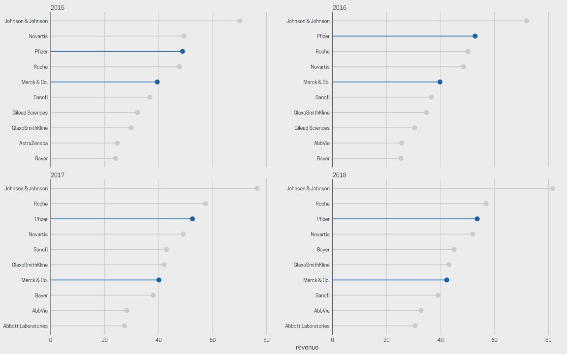 Sharon Machlis
ggcharts faceting is simple using the facet argument.
To make code potentially even simpler, you can combine ggcharts with the ggeasy package. ggeasy offers a user-friendly way to tweak things like axis text. Load the package and start typing easy_ plus something you’re looking for, like y_axis, and you’ll see a drop-down menu of function choices in RStudio.
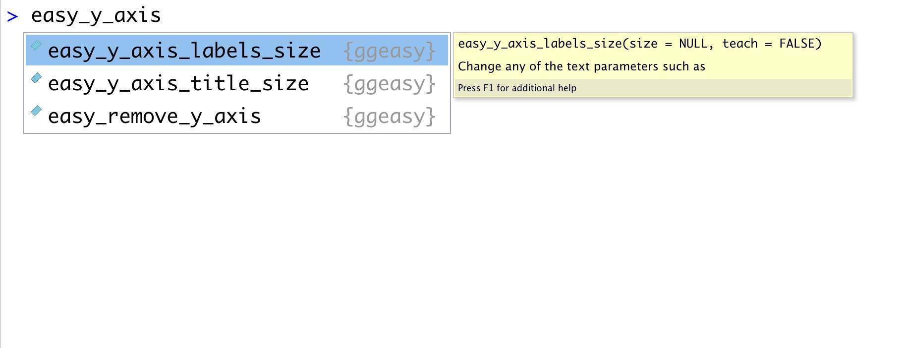 Sharon Machlis
Start typing easy_ to see options in the ggeasy package.
Below is how I’d change the y-axis text size of a basic lollipop plot by adding ggplot2 code.
biomedicalrevenue %>%
  filter(year == max(year)) %>%
  lollipop_chart(x = company, y = revenue, top_n = 10) +
  theme(axis.text.y = element_text(size=16))
And here’s how to do it with ggeasy:
biomedicalrevenue %>%
  filter(year == max(year)) %>%
  lollipop_chart(x = company, y = revenue, top_n = 10) +
  easy_y_axis_labels_size(16)
Finally, one more package to be aware of if you’re interested in easier ggplot2 graphics is esquisse. This R package offers drag-and-drop ggplot, and it generates R code you can use in your scripts. I covered this in an earlier video you can watch below.
For more R tips, head to the “Do More with R” page on InfoWorld or check out the “Do More with R” YouTube playlist.