


R has some excellent mapping options. There is the leaflet R package, which I use when I want to do a lot of customization. There is tmap, which I like for its nice balance between power and ease of use. And recently I’ve started also using mapview.
mapview’s raison d’être is exploratory visualization — more specifically, generating useful default maps with very little code. As little code as:
mapview(mydata, zcol = "mycolumn")
One function, two arguments, done. That makes it extremely easy to explore geospatial data, or to create a fast prototype. Plus mapview has a few cool syntax options for viewing multiple maps.
mapview in action
For this demo I’ll use a shapefile of US states and data about population changes by state in the last 20 years. If you want to follow along, download the data zip file:
As usual, first a little bit of data prep. The code below loads four packages, downloads a GIS file defining state polygon borders, then joins that with state populations in 2000, 2010, and 2020.
library(tigris)
library(mapview)
library(dplyr)
library(sf)
us_geo <- tigris::states(cb = TRUE, resolution = '20m')
pop_data <- readr::read_csv("state_population_data.csv")
all_data <- inner_join(us_geo, pop_data, by = c("GEOID" = "GEOID")) With my data ready, this single line of code is all I need to create an interactive map to explore my data, colored by percent change between 2010 and 2020:
mapview(all_data, zcol = "PctChange10_20")
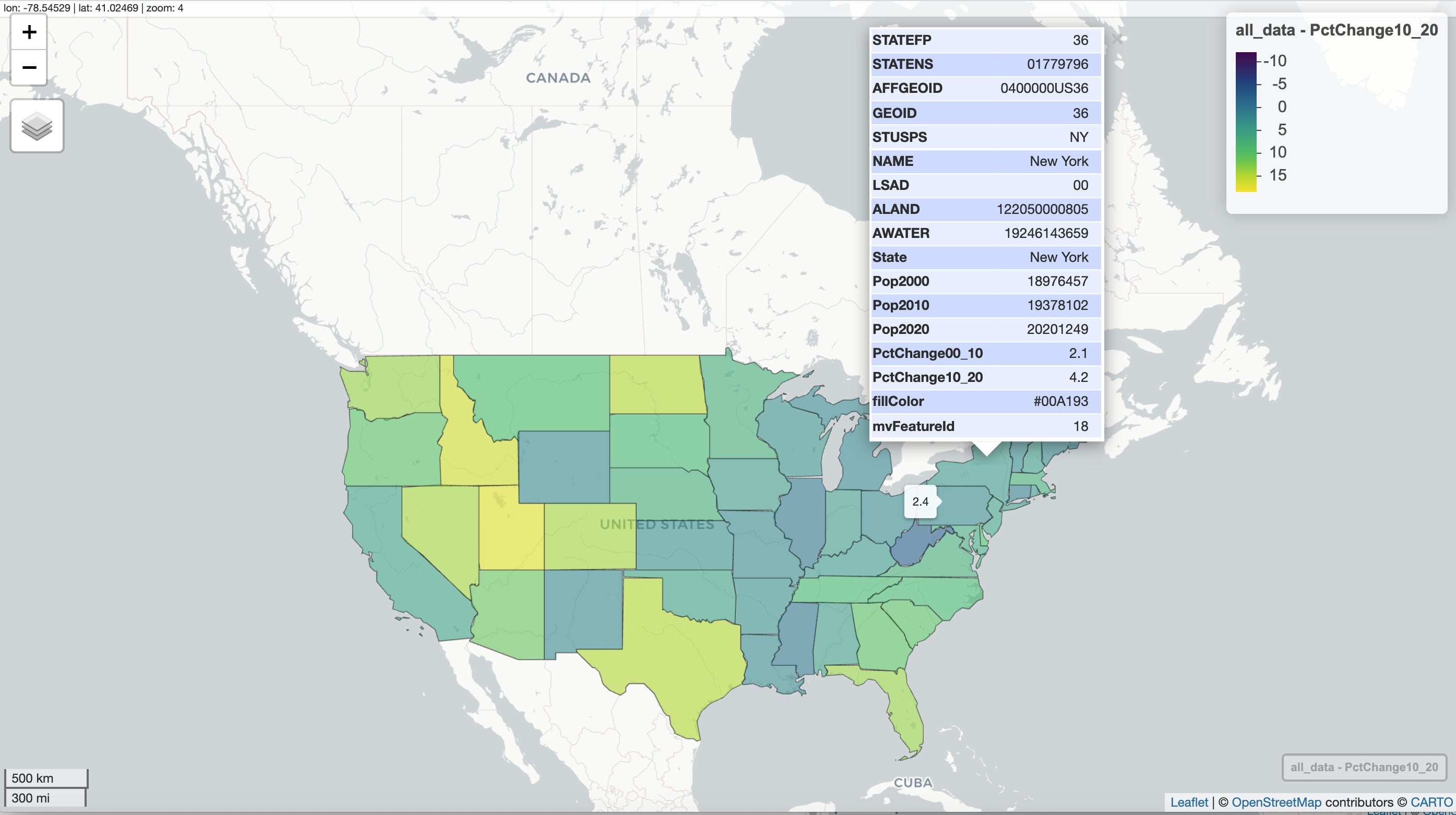
A screenshot of the default map is shown below, including a pop-up table which appears if you click on a state and hover text which appears if you hover/mouse over a state.
 Screenshot by Sharon Machlis
Default mapview map generated with one small line of code.
Notice what’s not in the code that generated this map. I didn’t have to specify in any way that I’m analyzing polygons or that I want a map colored by polygon; mapview() chose defaults based on the type of geospatial file. The code mapview(all_data, zcol = "PctChange10_20") is all you need to generate an interactive choropleth map — including hover text and pop-ups.
The default pop-up includes every field in my data, and it is probably not what I’d want an end user to see. However, it’s useful for exploring my data. And the pop-up is customizable, which I’ll get to in a bit.
If your data set doesn’t have row names, mapview() uses the row number for the pop-up table’s top row. You can add row names to your data set with base R’s row.names() function to get more user-friendly table titles.
By the way, if your table doesn’t look as nicely formatted as the one in this map, try updating GDAL on your system. I updated the rgdal package on my system and it solved a table formatting problem.
More mapview features
If you look very carefully at the top left of the map in the screenshot above, you should see some text showing the longitude and latitude of where my mouse was at the time I captured the image, as well as the leaflet map zoom level. Both of those change as you interact with the map.
This default map also includes scale in kilometers and miles at the bottom left. And, at the bottom right, there is a button with the name of the data set and column. If you move the map around or zoom in or out, clicking that button brings you back to the map starting point.
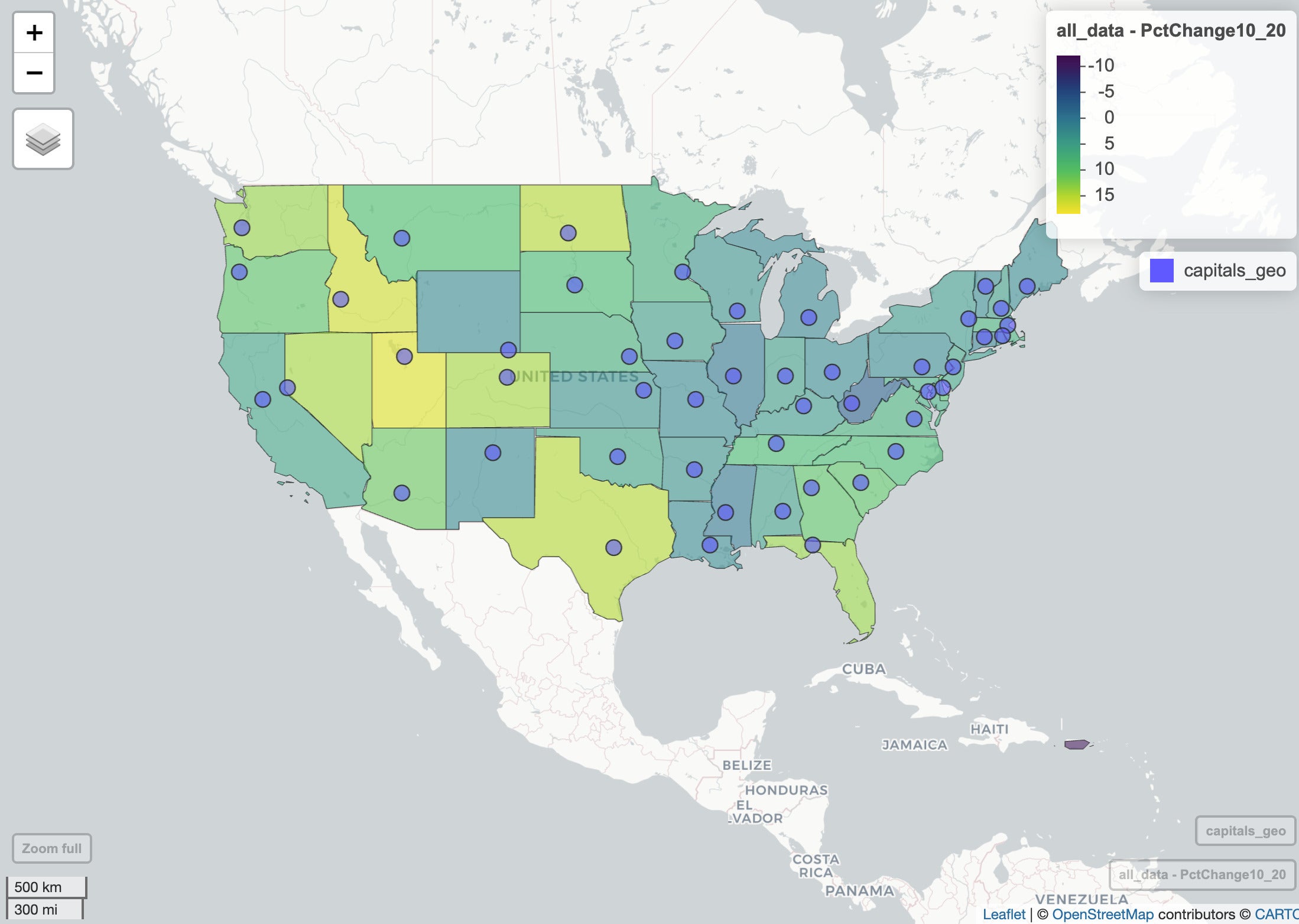
Visualize points with mapview
Adding points to a map is just as easy as polygons. For points, I’ll use a CSV file of state capitals with their longitude and latitude.
In the code below, I use the rio package to read the CSV, but you could use another option such as readr::read_csv(). To use latitude and longitude data for GIS work in R (not only for mapview), you then need to turn the data frame into a spatial object. The sf package’s st_as_sf() function does this.
capitals <- rio::import("us-state-capitals.csv")
capitals_geo <- st_as_sf(capitals, coords = c("longitude", "latitude"),
                crs = 4326)
st_as_sf() needs as arguments the data frame, a vector defining which columns have longitude and latitude info, and your desired coordinate reference system, in this case one used by a lot of background map tiles.
Once the data is transformed, I can use it to add a points layer to my map with another call to mapview():
mapview(all_data, zcol="PctChange10_20") +
  mapview(capitals_geo)
I didn’t have to tell mapview that capitals_geo contains points, or which columns hold latitude and longitude data. In fact, once I create my first mapview object, I can add layers to the map without calling mapview() again; I can just use the point object’s name:
mapview(all_data, zcol = "PctChange10_20") + capitals_geo
The map now looks like this:
 Screenshot by Sharon Machlis
Map with polygons and points.
Invoke automatic visualizations
You can also ask mapview to automatically visualize geospatial objects in your R session. The package’s startWatching() function creates a map of any sf object you add to or change in your R session after the function is invoked. You can see how it works in the video embedded at the top of this article.
Customize R maps with mapview
There are mapview() arguments to customize map options such as color for polygon boundary lines, col.regions for polygon fill colors, and alpha.regions for opacity.
You can rename a layer with the layer.name argument if you want a more user-friendly layer name. This appears on the legend, the bottom right button, and when opening the layer button toward the top left.
In this next code block, I change the polygon colors and opacity using the “Greens” palette from the RColorBrewer package and an opacity of 1 so the polygons are opaque. (Note you will need the RColorBrewer package installed if you want to run this code on your system.)
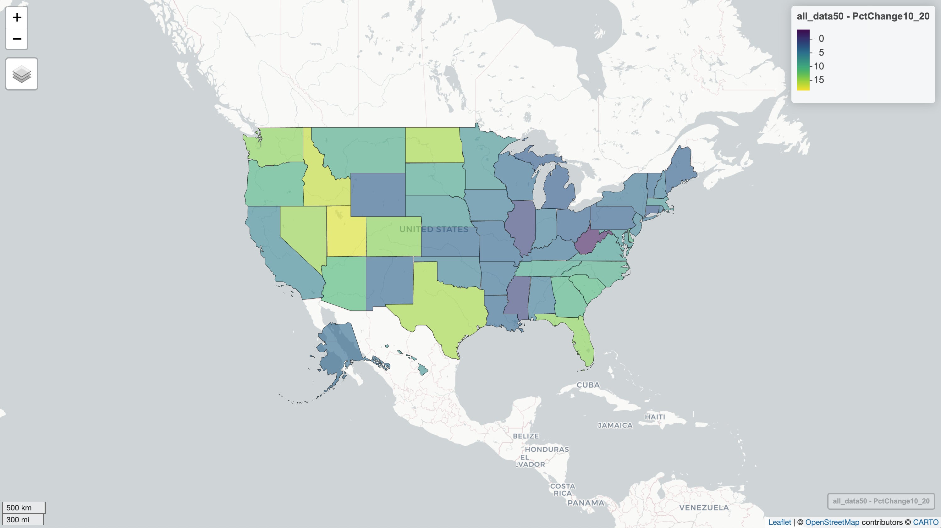
 mapview(all_data, zcol = "PctChange10_20",
         col.regions = RColorBrewer::brewer.pal(9, "Greens"),
         alpha.regions = 1)
The Greens palette has a maximum of nine discrete colors. mapview complains if you don’t give it a palette with the number of colors it needs, as in the warning below, but it will do the interpolating work for you.
Warning message:
Found less unique colors (9) than unique zcol values (41)!
Interpolating color vector to match number of zcol values.
You can use a diverging palette in your map, too, such as the RdYlGn palette:
mapview(all_data, zcol = "PctChange10_20",
         col.regions = RColorBrewer::brewer.pal(11, "RdYlGn"), alpha.regions = 1)
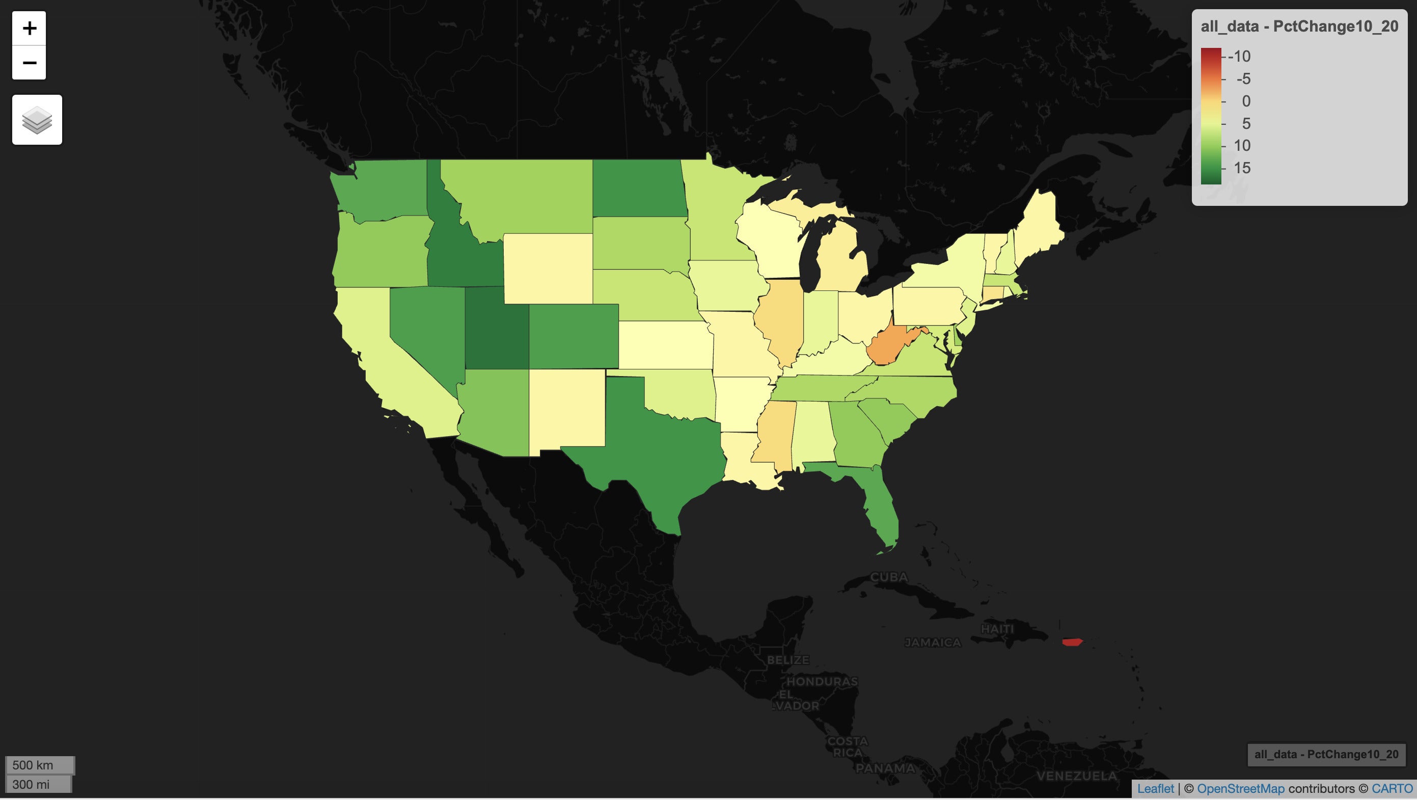 Screenshot by Sharon Machlis
This map’s dark background appeared automatically, because mapview determined the map included a lot of light colors. You can turn off that basemap behavior with
mapviewOptions("basemaps.color.shuffle" = FALSE)Visualize two maps together
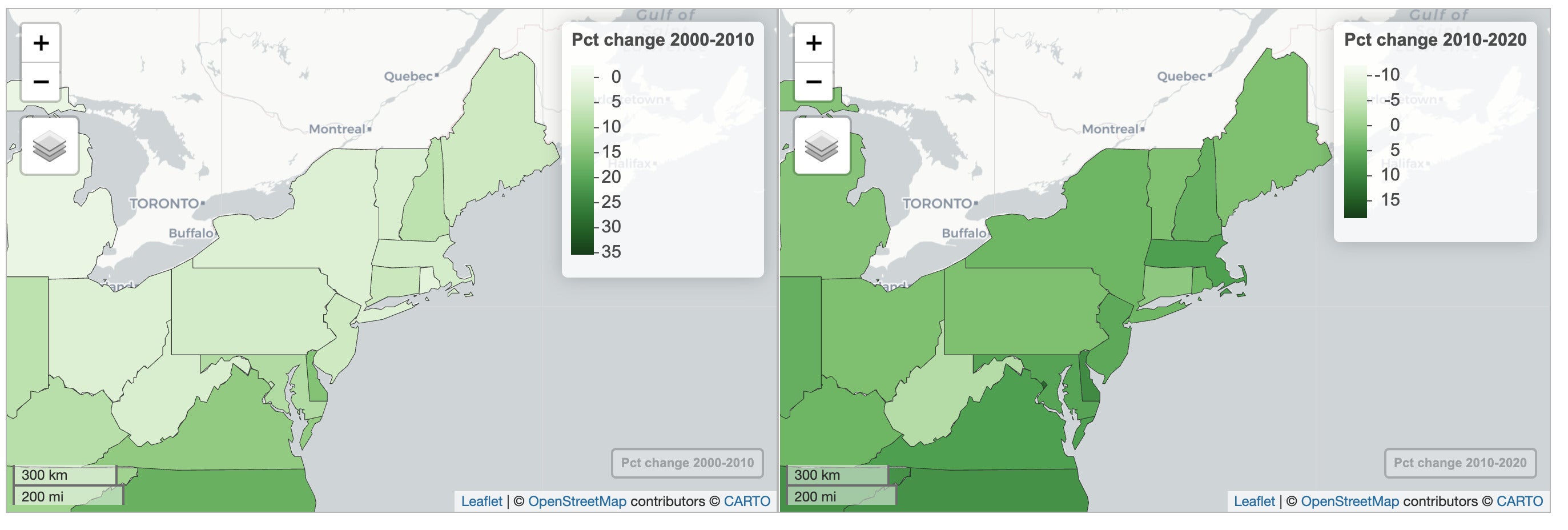
Now to a couple of those cool syntax options I mentioned at the beginning. Here I’m creating two maps, one for the 2010 to 2020 population change and the other for 2000 to 2010:
map2020 <- mapview(all_data, zcol = "PctChange10_20",
                   col.regions = RColorBrewer::brewer.pal(9, "Greens"), alpha.regions = 1,
                   layer.name = "Pct change 2010-2020"
)
map2010 <- mapview(all_data, zcol = "PctChange00_10",
                   col.regions = RColorBrewer::brewer.pal(9, "Greens"), alpha.regions = 1,
                   layer.name = "Pct change 2000-2010"
)
You can place the maps side by side and have them move in sync with the leafsync package and the sync() function.
library(leafsync)
sync(map2010, map2020)
 Screenshot by Sharon Machlis
These two maps pan, zoom, and move in sync together.
Or, you can put two maps on the same layer and have a side-by-side slider to compare the two, thanks to the leaflet.extras2 package and the | (Unix pipe, not R pipe) character.
map2010 | map2020
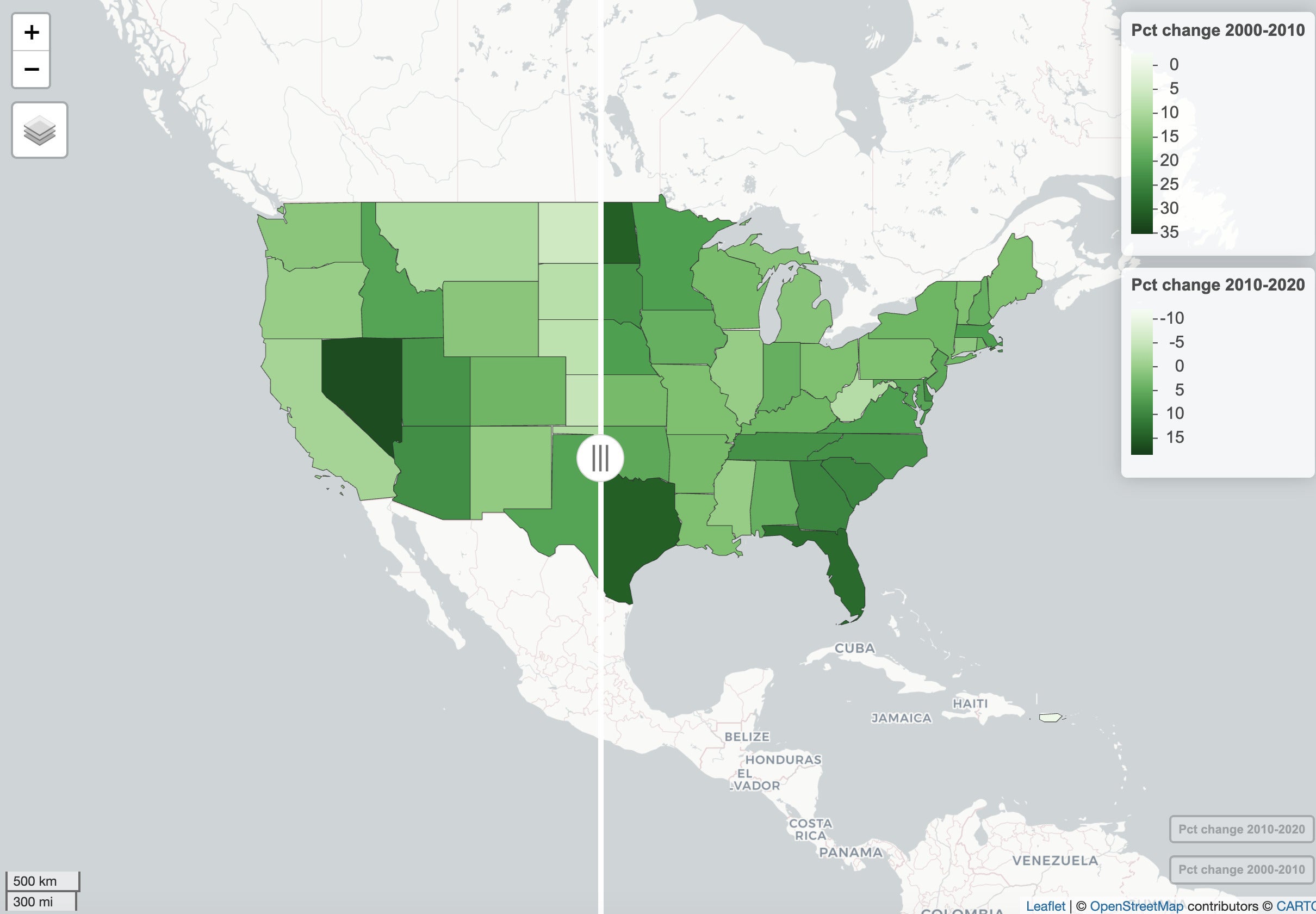 Screenshot by Sharon Machlis
The map slider can move left to right to show either the left or right map version.
Don’t want legends, pop-ups, or hover text on a map? Those can be turned off with
mapview(all_data, zcol = "PctChange10_20",
        legend = FALSE, label = FALSE, popup = FALSE)
You can also turn off the background map tiles by using a data set’s custom projection. One case where that’s useful is if you want a map of the US showing Alaska and Hawaii as insets, instead of where they actually are geographically, for a more compact display.
The first four lines of code below use the albersusa package to generate a GIS file with Alaska and Hawaii as insets. But the resulting default mapview map of this data still shows default background tiles, resulting in Alaska and Hawaii appearing overlayed onto Mexico.
library(albersusa)
us_geo50 <- usa_sf("lcc") %>% mutate(GEOID = as.character(fips_state))
pop_data50 <- readr::read_csv("data/state_population_data50.csv")
all_data50 <- inner_join(us_geo50, pop_data50, by = c("GEOID" = "GEOID"))
mapview(all_data50, zcol = "PctChange10_20")
 Screenshot by Sharon Machlis
Sometimes you would like to use a custom projection and remove the background map tiles.
If I tell mapview to use the data’s native projection, though, the projection is accurate and the background no longer includes map tiles.
mapview(all_data50, zcol = "PctChange10_20",
        native.crs = TRUE)
 Screenshot by Sharon Machlis
Using a custom projection can allow for more flexible displays, such as this map of the US with Alaska and Hawaii as insets.
More R mapview customizations
You can customize your bin breakpoints with the at argument. In the code below, I set breaks using base R’s seq() function, going from -4 to 20 by increments of 2. The map colors and legend will show the new breaks.
mapview(all_data, zcol = "PctChange10_20",
        at = seq(-4, 20, 2))
You can customize your pop-ups and hover text using the same techniques as with the leaflet R package. I’m sure there are multiple ways to do this, but this is my usual process:
First, create a vector of character strings — with HTML code if you want formatting — using the full dataframe$column_name syntax for variables. I find the glue package useful for this, although you could paste() as well. For example:
mylabel <- glue::glue("{all_data$State} {all_data$PctChange10_20}%")Second, apply the htmltools package’s HTML() function to the vector with lapply() so you end up with a list — because you need a list — such as:
mypopup <- glue::glue("<strong>{all_data$State}</strong><br />
                      Change 2000-2010: {all_data$PctChange00_10}%<br />
                      Change 2010-2020: {all_data$PctChange10_20}%") %>%
  lapply(htmltools::HTML)
mylabel <- glue::glue("{all_data$State} {all_data$PctChange10_20}%") %>%
lapply(htmltools::HTML)My pop-up list now looks something like this:
head(mypopup, 3)
[[1]] <strong>Washington</strong><br />
  Change 2000-2010: 14.1%<br />
  Change 2010-2020: 14.6%
[[2]] <strong>Puerto Rico</strong><br />
  Change 2000-2010: -2.2%<br />
  Change 2010-2020: -11.8%
[[3]] <strong>South Dakota</strong><br />
  Change 2000-2010: 7.9%<br />
  Change 2010-2020: 8.9%